See live: aafswfl.com
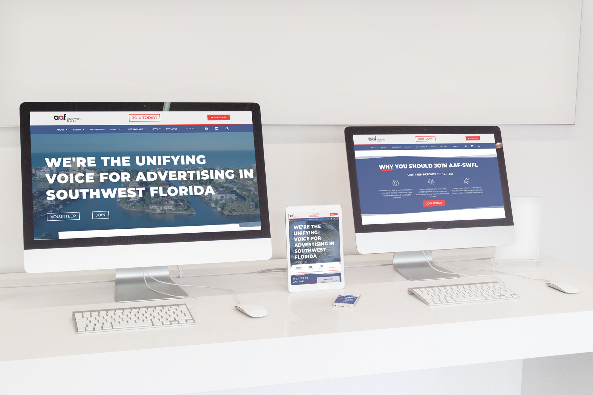
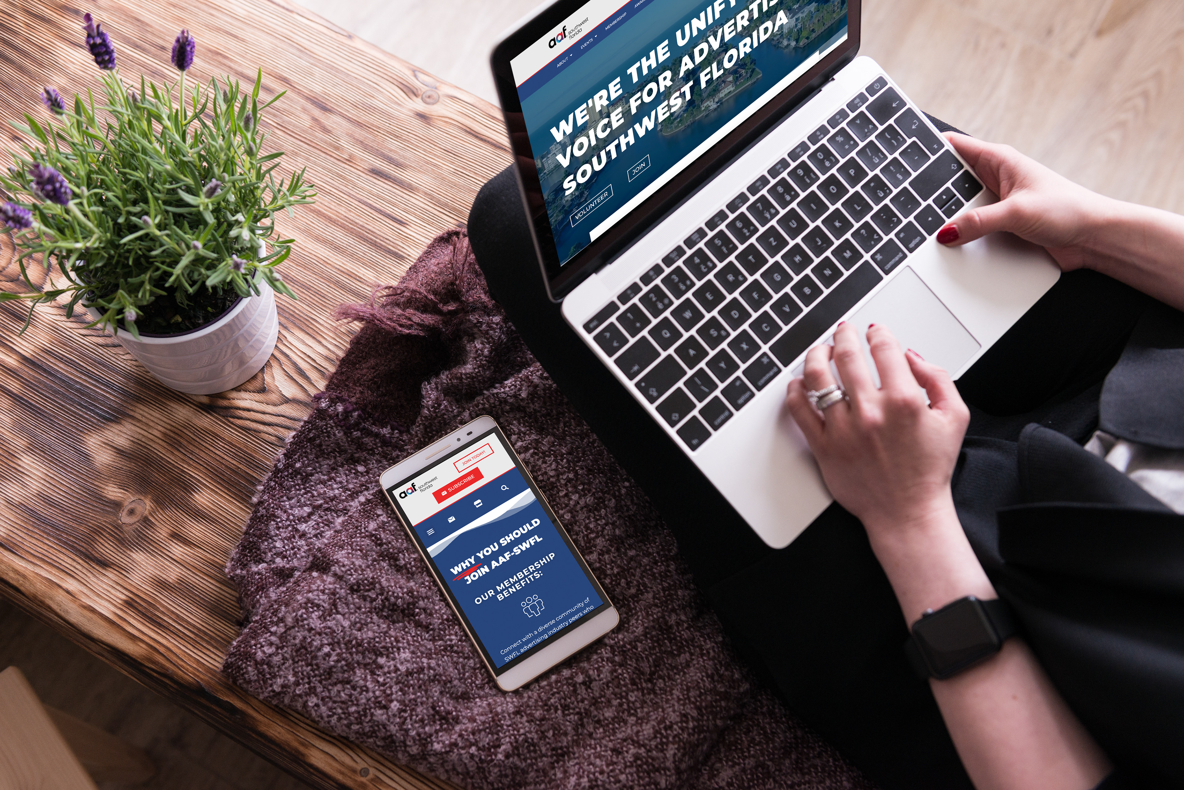
Local chapter, outdated site, scattered content. I partnered with the creative director, account executive, and a dev team to rebuild AAF SWFL’s website into a cleaner, brighter platform: bold type, a hero video, and subtle wave motion that nods to Southwest Florida and keeps the experience feeling alive.
Challenge:
Revamp the AAF SWFL chapter site so it better represents the local creative community. Modern visuals, higher energy, and an easy-to-read, accessible way to explore content.
Revamp the AAF SWFL chapter site so it better represents the local creative community. Modern visuals, higher energy, and an easy-to-read, accessible way to explore content.
Role:
Web design lead; visual direction, UX/UI layout, typography system, motion direction (wave interaction), content clarity + readability, and dev collaboration/handoff.
Web design lead; visual direction, UX/UI layout, typography system, motion direction (wave interaction), content clarity + readability, and dev collaboration/handoff.
Process:
Discovery & Direction: Aligned on a shared goal: a site that feels vibrant and current while staying clear and community-first.
Layout & Hierarchy: Simplified pages and leaned into strong sectioning so content is easy to scan.
Type-Led System: Used big, bold typography as a primary design element to improve readability and make key information hard to miss.
Motion & Atmosphere: Introduced subtle wave movement across the UI to add fluidity, reflect the region, and signal “creative industry energy” without distraction.
Hero Engagement: Integrated a hero video to pull visitors in immediately and set the tone from the first scroll.
Build Partnership: Worked closely with developers to translate motion + layout intent cleanly into the final site.
Solution:
A refreshed, high-energy chapter website that feels like AAF SWFL. Clean, modern, and content-forward, with motion and video used intentionally to add personality without sacrificing clarity.
A refreshed, high-energy chapter website that feels like AAF SWFL. Clean, modern, and content-forward, with motion and video used intentionally to add personality without sacrificing clarity.
Outcome:
Gold — AAF SWFL ADDYs (2021)
Silver — AAF District 4 ADDYs (2021)
Gold — AAF SWFL ADDYs (2021)
Silver — AAF District 4 ADDYs (2021)
Deliverables:
Responsive website design (UX/UI), typographic system, motion direction for wave interactions, hero video integration guidance, and developer handoff.
Responsive website design (UX/UI), typographic system, motion direction for wave interactions, hero video integration guidance, and developer handoff.