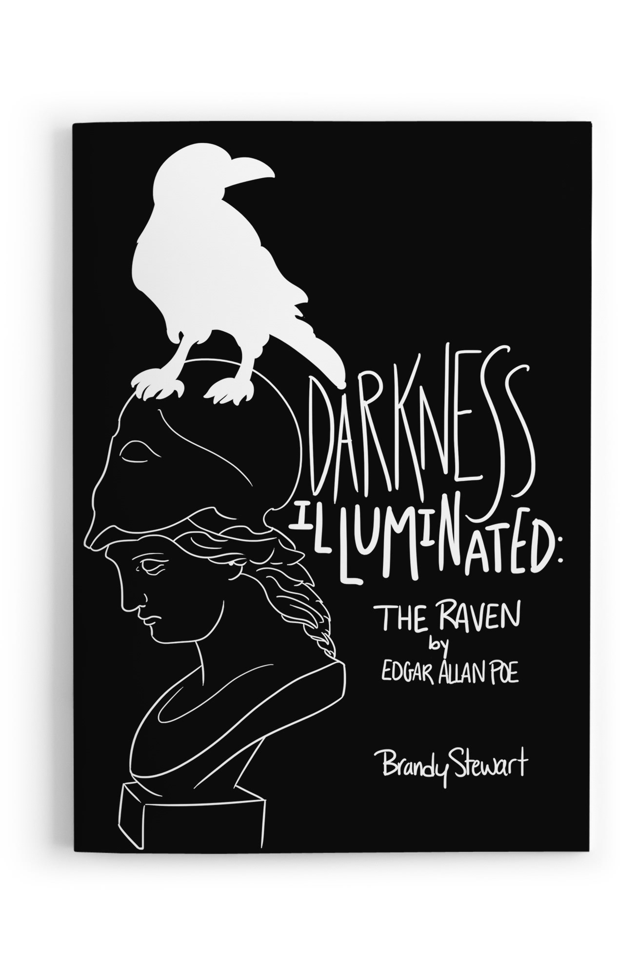
Hand-lettered "The Raven" as a black-and-white reading experience. I mapped the poem’s beats to scale, contrast, and simple icons—then built press-ready spreads where the refrain ‘Nevermore’ lands like a visual drum.
Challenge:
Transform a long-form poem into a kinetic, black-and-white reading experience—using only lettering, scale, and simple iconography—so pacing and emotion are felt without traditional illustration.
Transform a long-form poem into a kinetic, black-and-white reading experience—using only lettering, scale, and simple iconography—so pacing and emotion are felt without traditional illustration.
Role:
Hand-lettering, illustration, art direction, layout, production.
Hand-lettering, illustration, art direction, layout, production.
Process:
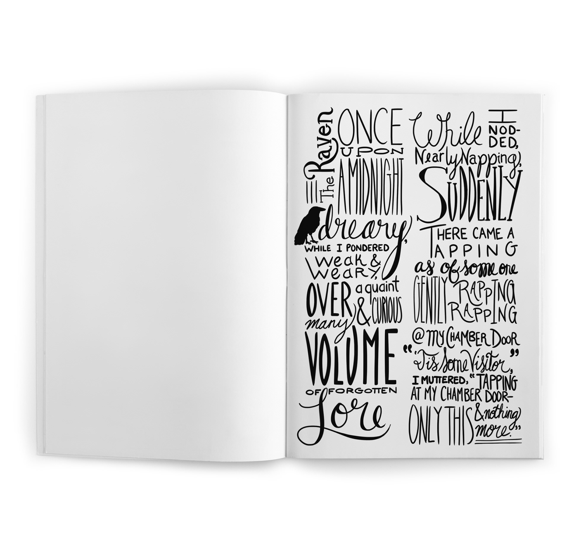
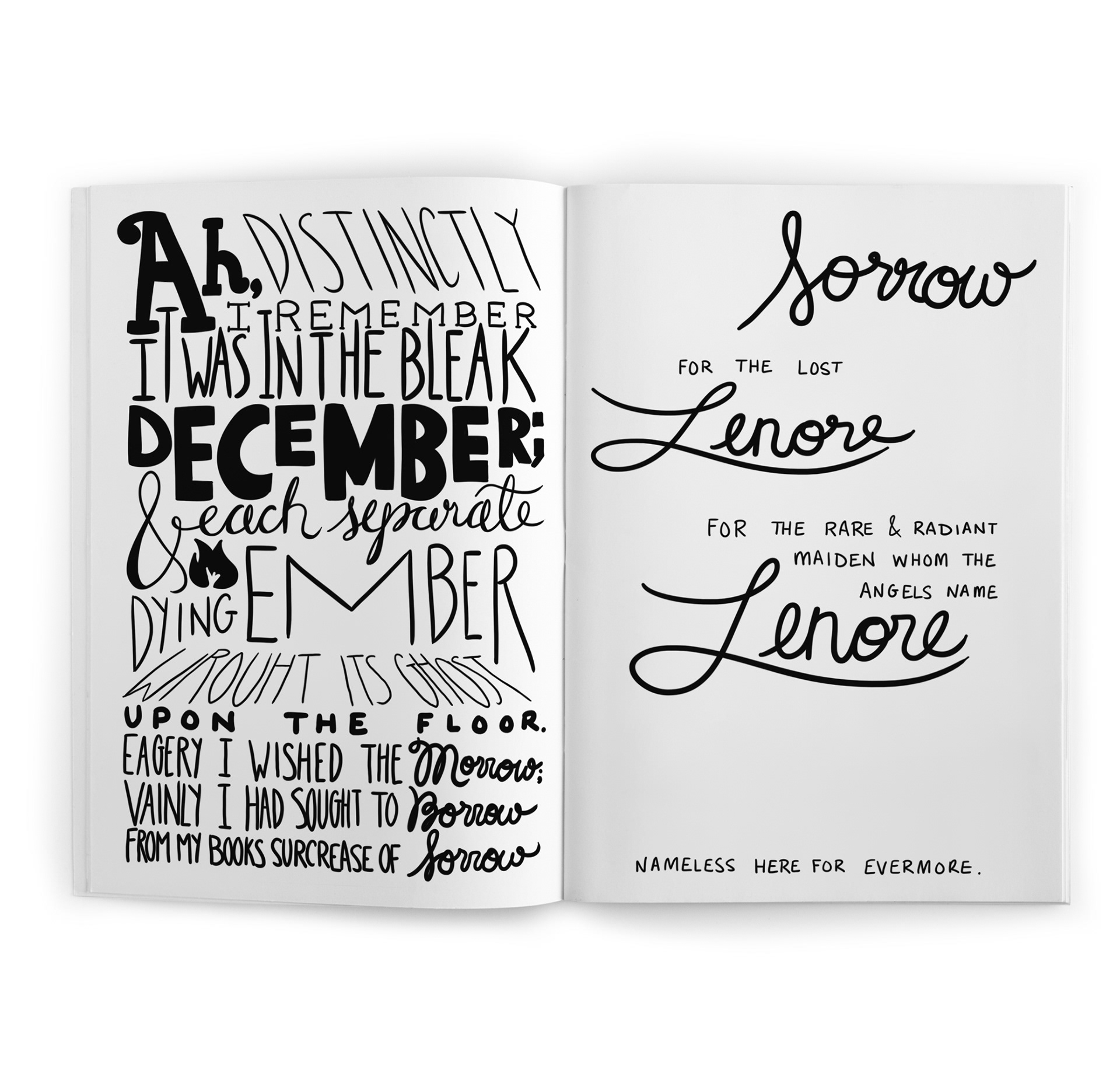
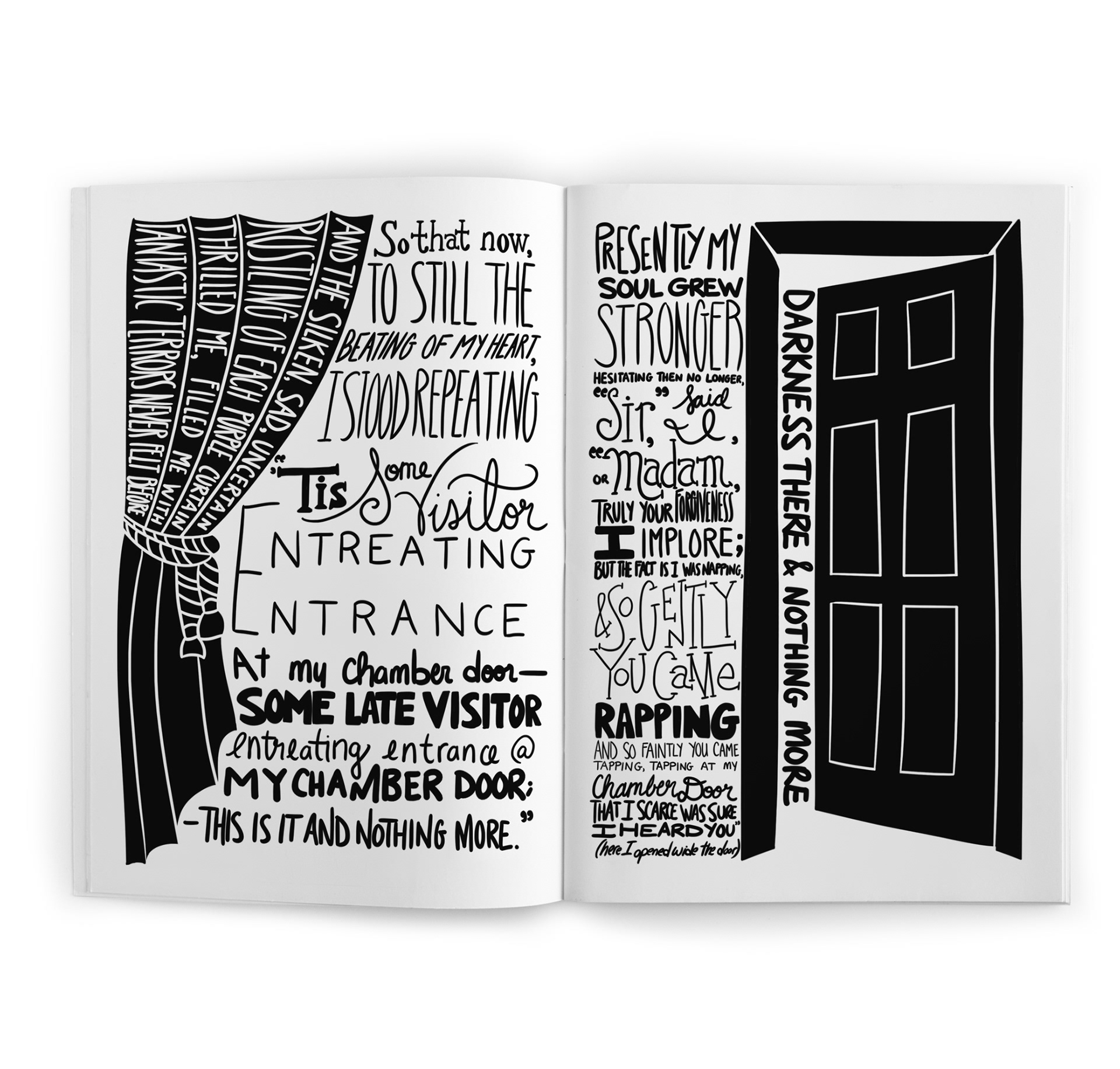
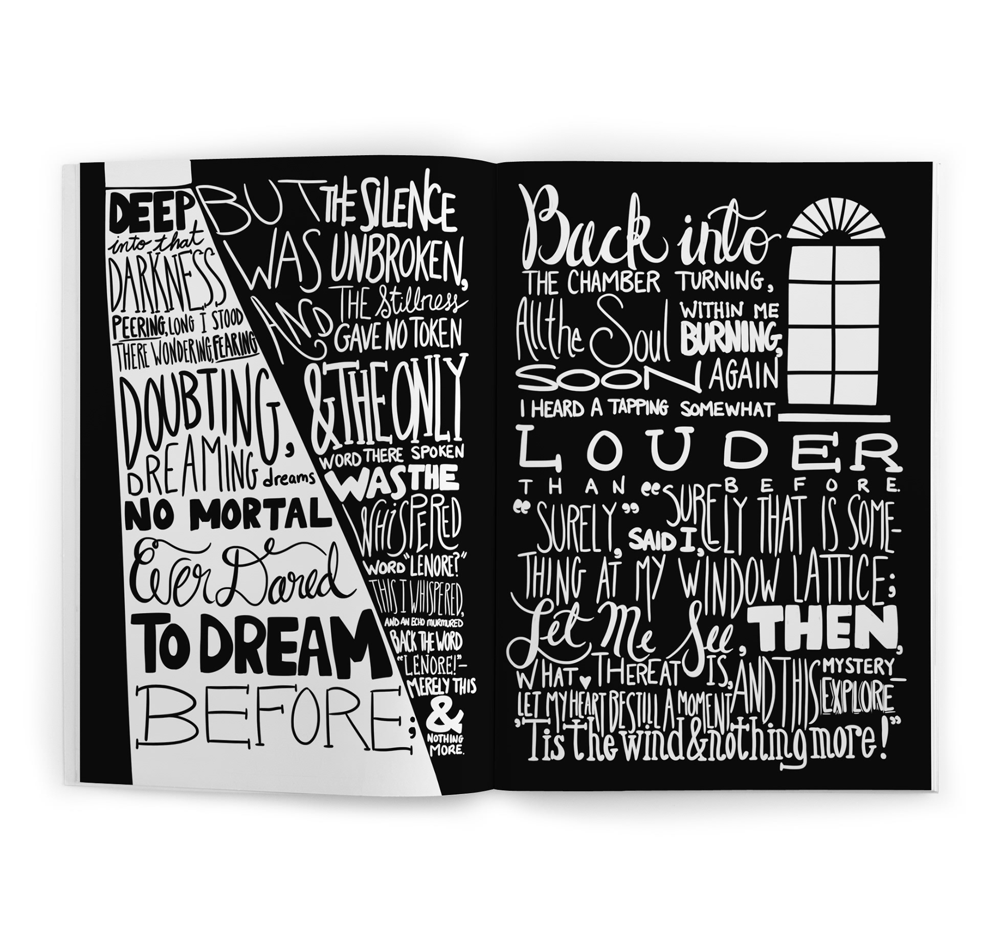
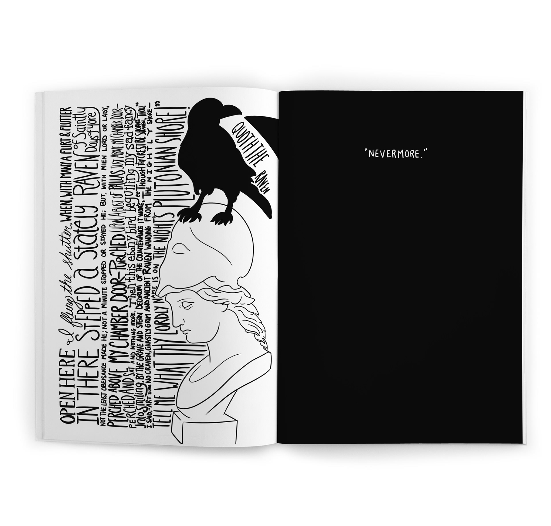
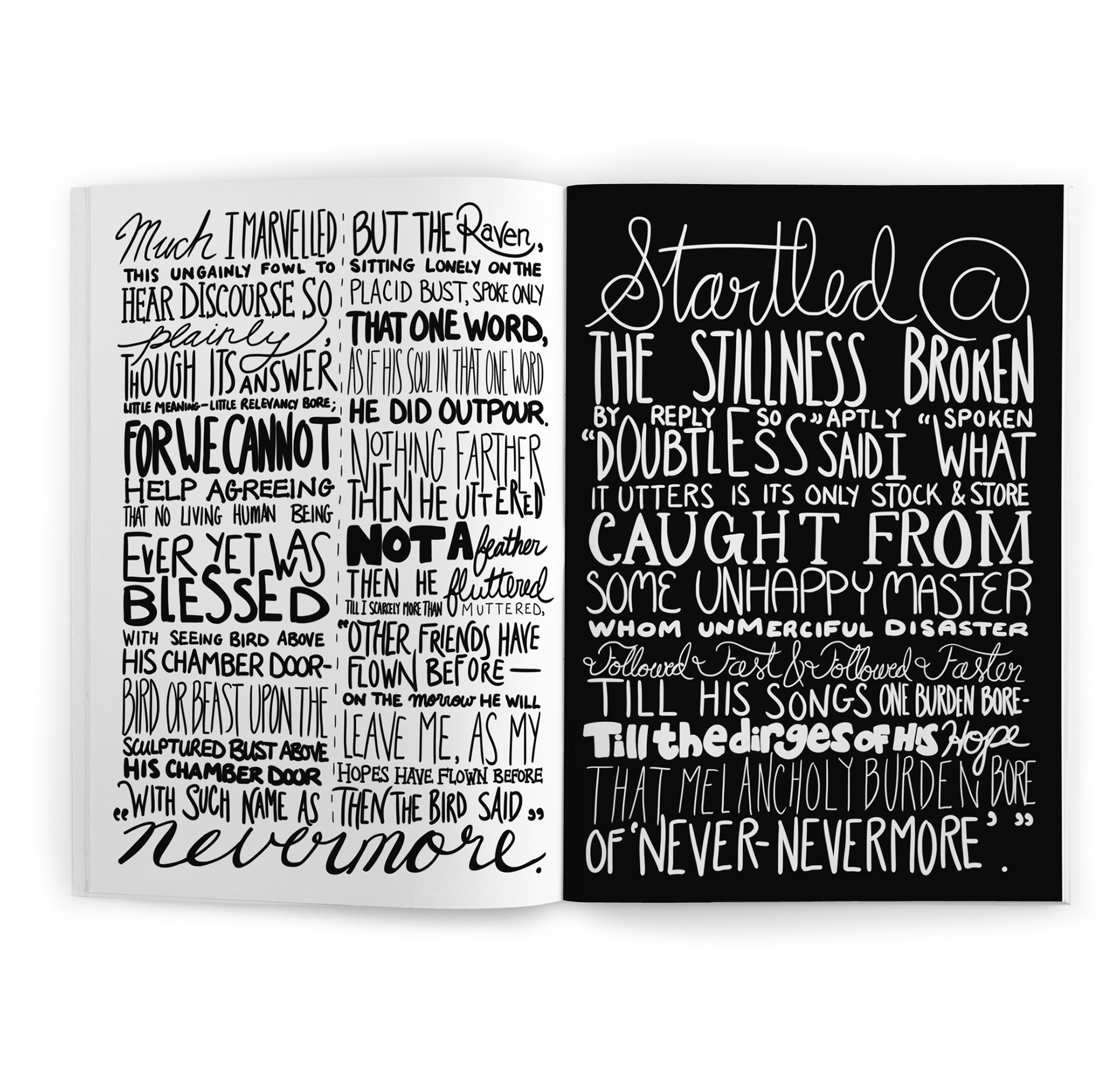
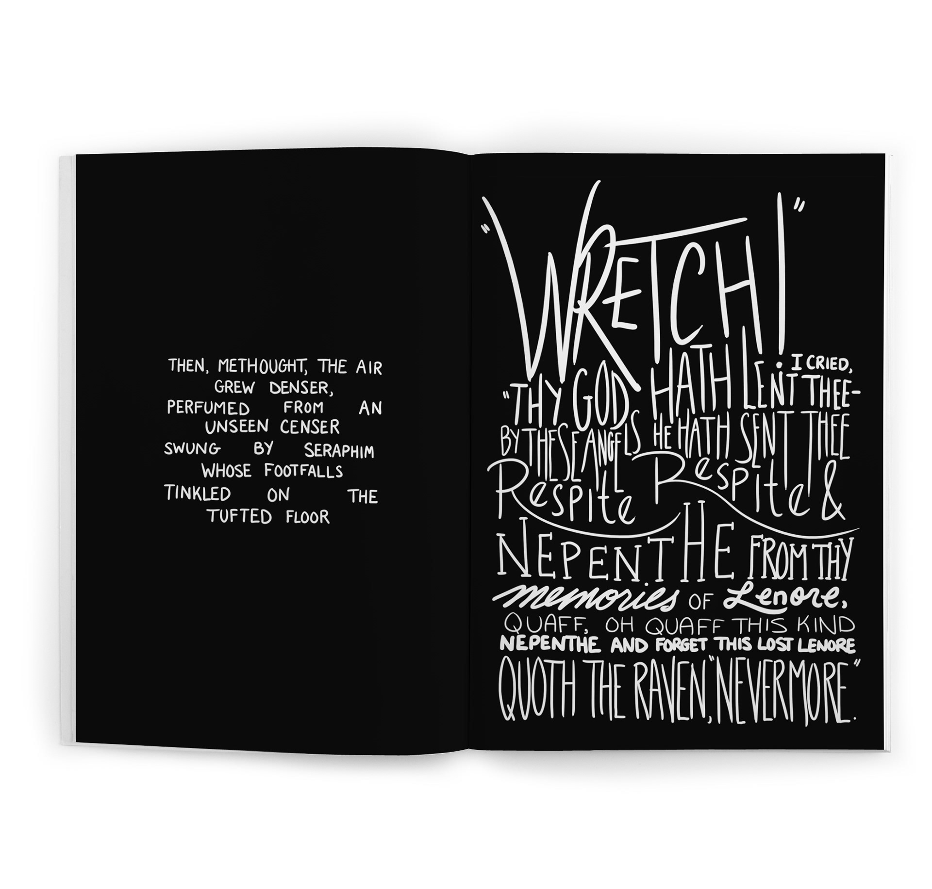
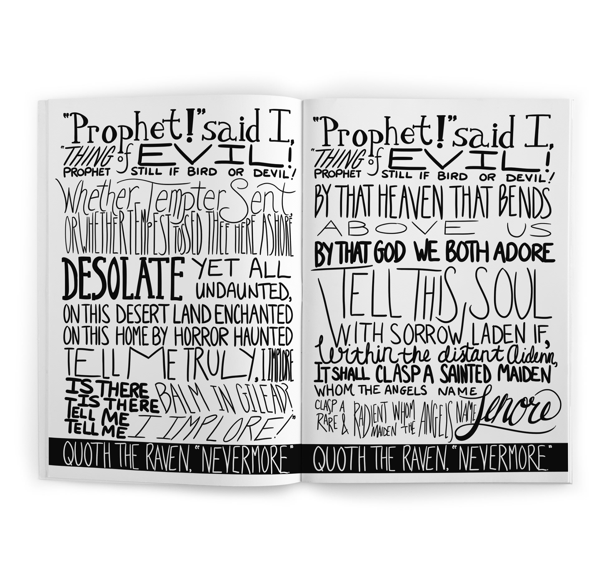
Text to Structure: Broke the poem into beats (knock, window, bust of Pallas, “Nevermore”) and mapped emphasis words to scale/weight shifts to control rhythm.
Text to Structure: Broke the poem into beats (knock, window, bust of Pallas, “Nevermore”) and mapped emphasis words to scale/weight shifts to control rhythm.
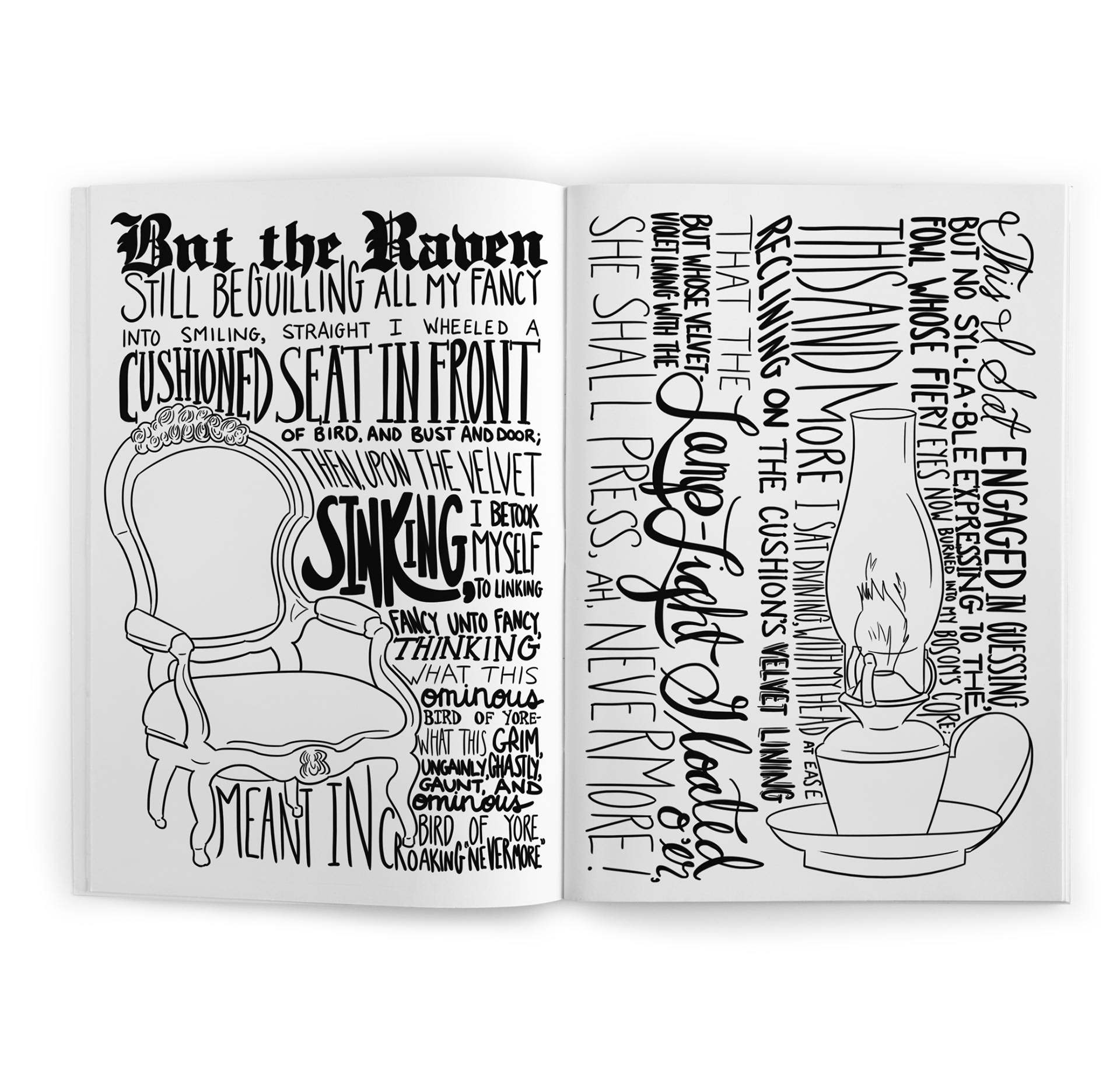
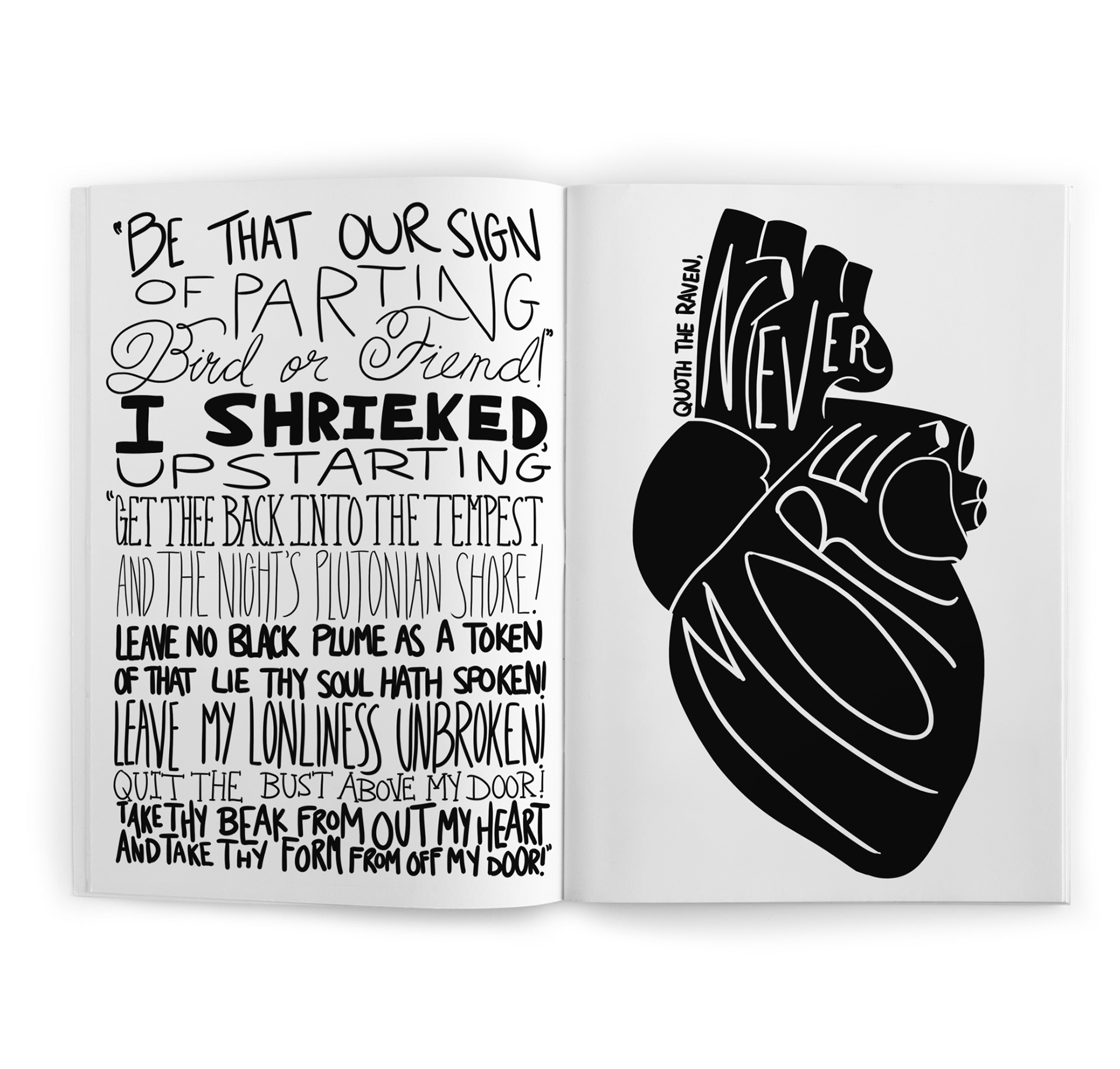
Visual Vocabulary: Limited palette to pure black/white; added a small set of anchors (raven silhouette, window, door, bust) to orient the reader between dense type fields.
Lettering Flow: Worked intentionally loose—minimal thumbnails—to let letterforms “breathe with the line,” then vectorized and refined for consistent baselines and margins.
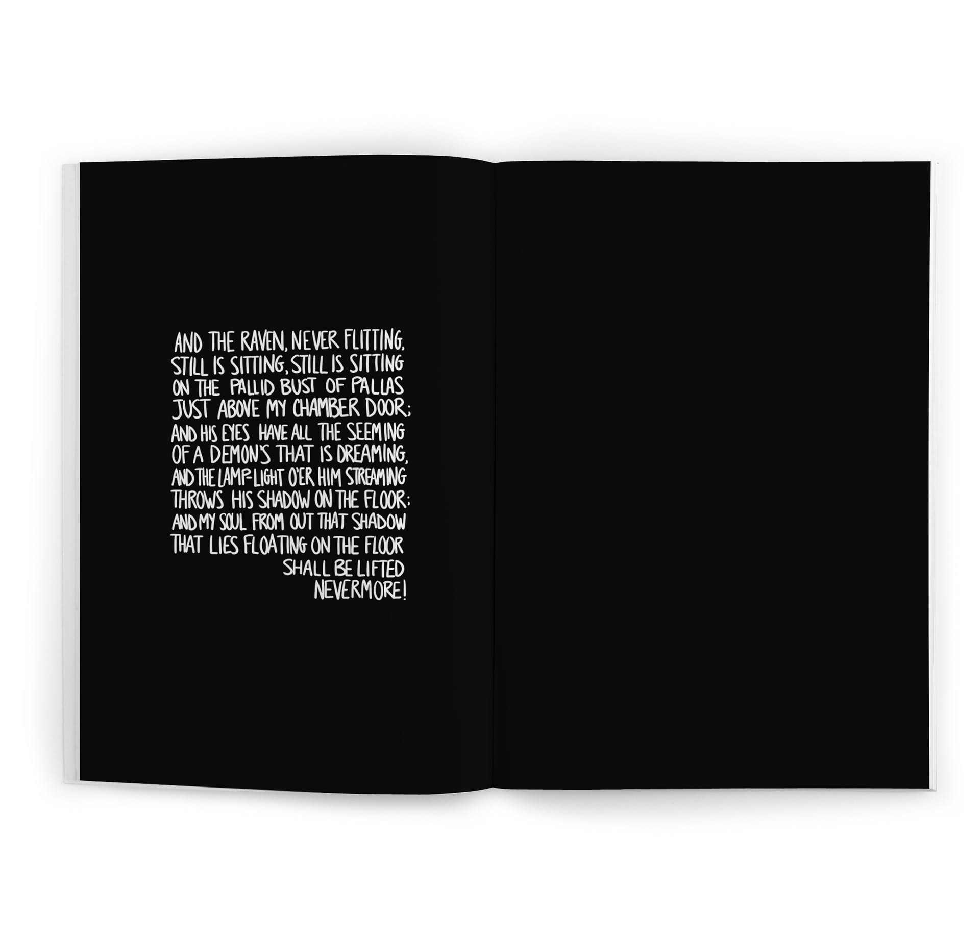
Composition Rules: Alternated heavy and airy spreads, used diagonals and gutters as breaks, and reserved full-bleed black pages for impact moments (“Nevermore.”).
Production: Built an InDesign master with paragraph/character styles for repeated motifs, prepared press-ready files (ink limits/bleeds), and created a cover that ties the interior language to a shelf-read title.
Solution:
A typographic narrative where scale, contrast, and negative space carry tone: the reader feels the tapping, the hush, and the refrain through the page architecture as much as the words.
A typographic narrative where scale, contrast, and negative space carry tone: the reader feels the tapping, the hush, and the refrain through the page architecture as much as the words.
Outcome
Featured in The Alumni Art Exhibition, Marketview Arts (York, PA, 2017). Strong viewer engagement (lingering time per spread during the show).
Featured in The Alumni Art Exhibition, Marketview Arts (York, PA, 2017). Strong viewer engagement (lingering time per spread during the show).