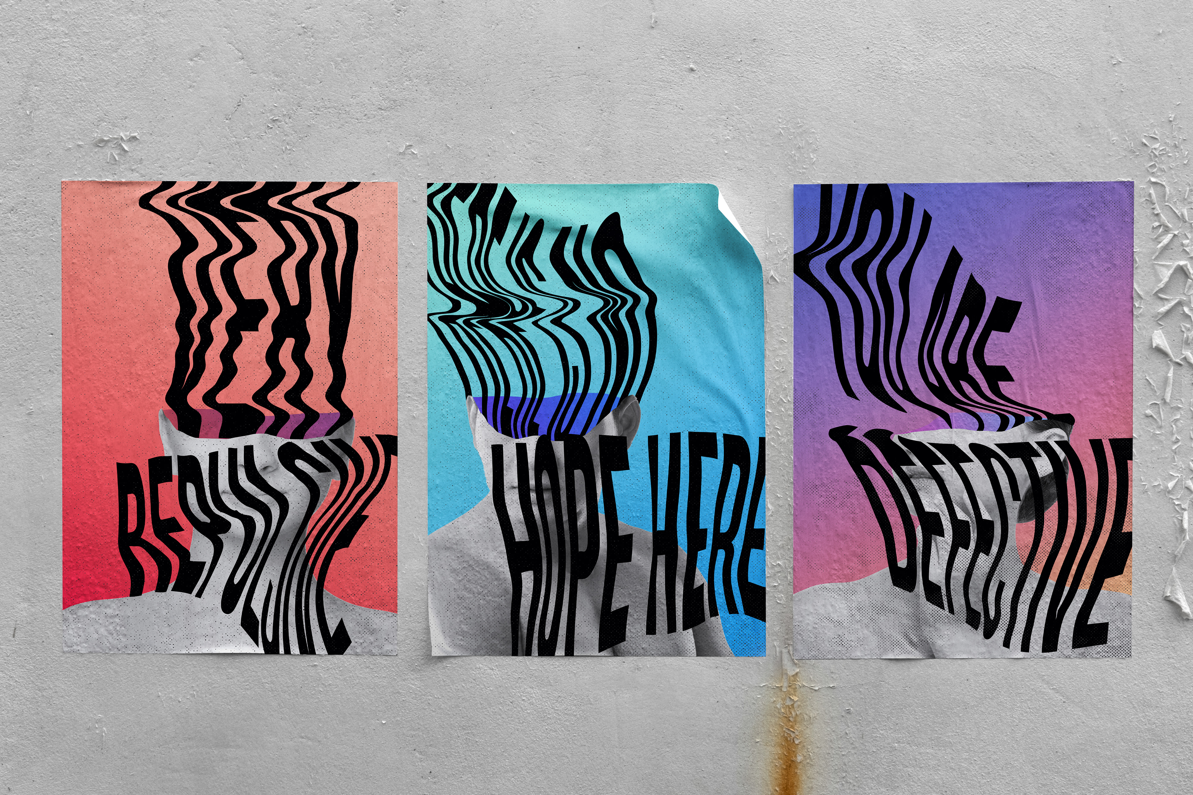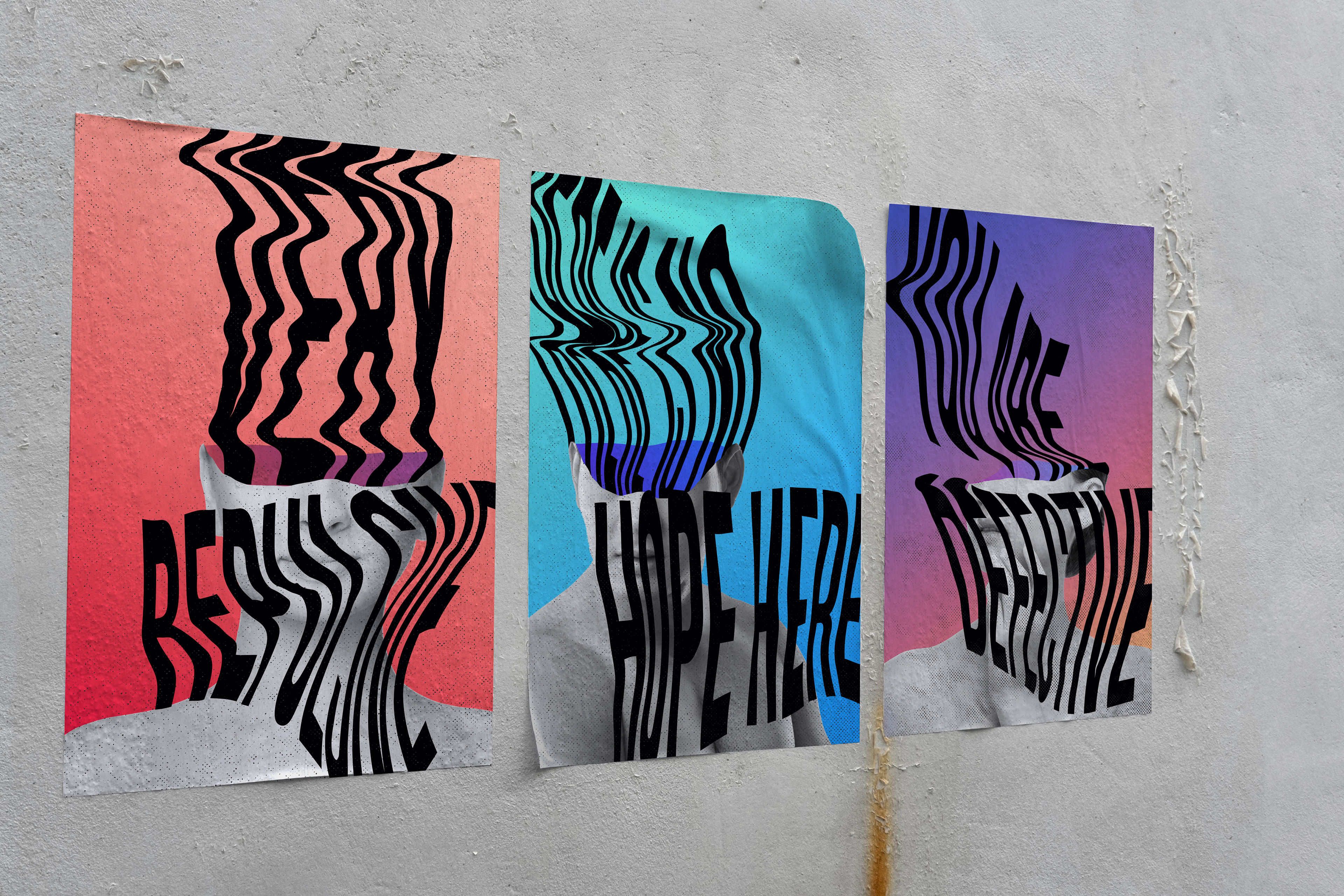
A poster series where warped type spills from monochrome portraits to depict intrusive thoughts. I built a distortion system (with contrast/legibility rules) and a gradient palette so the message hits hard on the wall and reads clearly in a feed.
Challenge:
Visualize what “distorted thinking” feels like (visceral, intrusive, hard to ignore) while keeping the words readable at street distance and thumb-stop clear in social feeds.
Visualize what “distorted thinking” feels like (visceral, intrusive, hard to ignore) while keeping the words readable at street distance and thumb-stop clear in social feeds.
Role:
Concept, art direction, photography editing, custom type distortion, layout, color, production mockups.
Concept, art direction, photography editing, custom type distortion, layout, color, production mockups.
Process:
Message set: Drafted short refrains that mirror common cognitive distortions (e.g., absolutism, catastrophizing).
Message set: Drafted short refrains that mirror common cognitive distortions (e.g., absolutism, catastrophizing).
Visual mechanic: Combined monochrome portraits with heavy type that “leaks” from the head. Established rules for warp amount, baseline drift, and counterform so letters stay legible even when stretched.
System design: Built a shared grid, halftone/film-grain texture stack, and a gradient palette (warm → cool) to signal emotional temperature.
Installation planning: Comped wall/poster mockups and spec’d paper + wheat-paste-safe coatings for pop-up displays.
Solution:
A triptych of posters where warped headlines surge out of grayscale figures over soft gradients. The distortion communicates the mind’s bend without sacrificing clarity; repetition across three prints turns private thoughts into a public conversation.
A triptych of posters where warped headlines surge out of grayscale figures over soft gradients. The distortion communicates the mind’s bend without sacrificing clarity; repetition across three prints turns private thoughts into a public conversation.
Outcome:
Used as a pop-up installation and digital campaign during a mental-health awareness week; strong dwell time and share-through on social, with requests for downloadable prints.
Used as a pop-up installation and digital campaign during a mental-health awareness week; strong dwell time and share-through on social, with requests for downloadable prints.