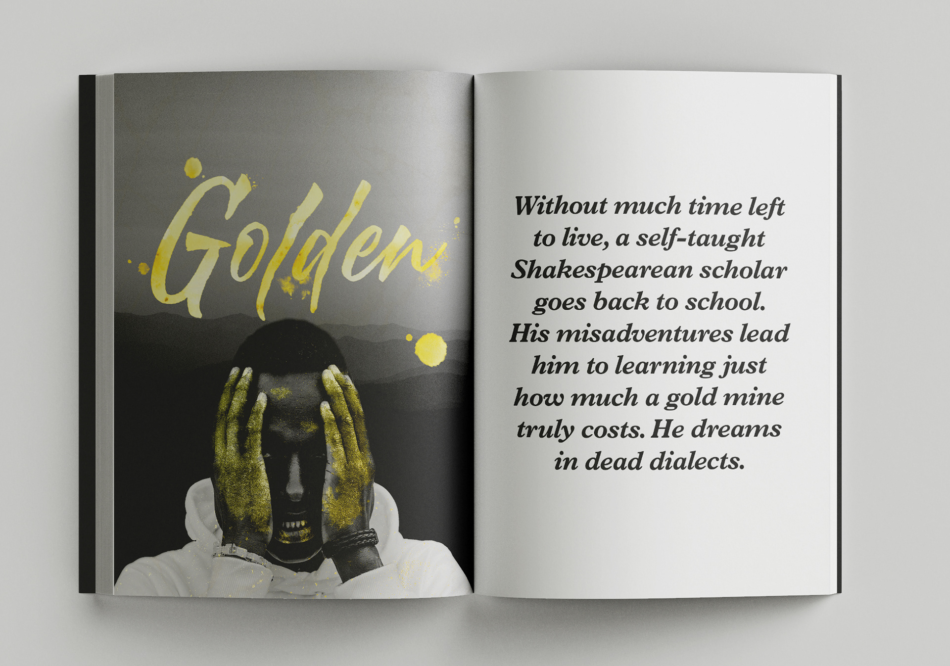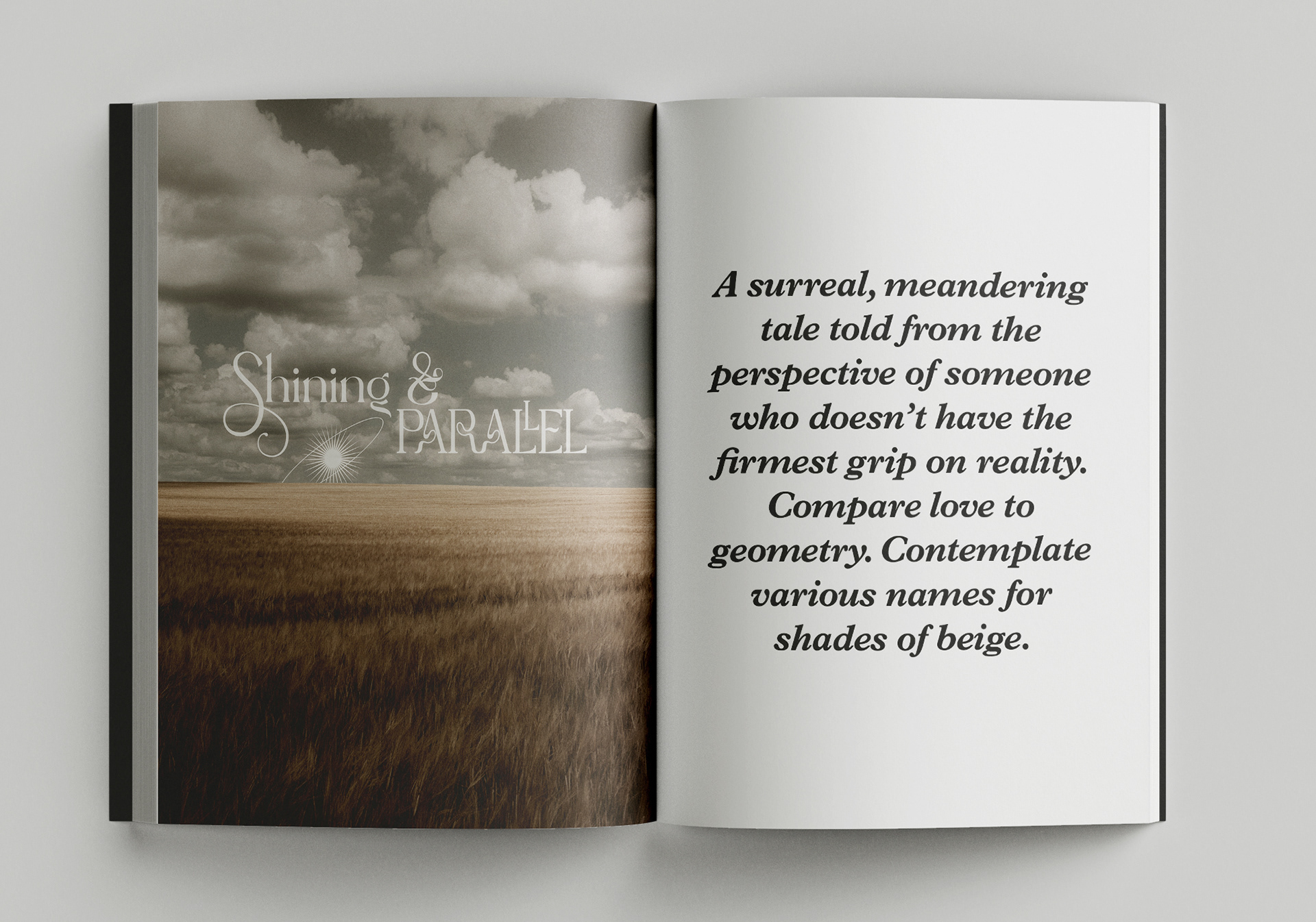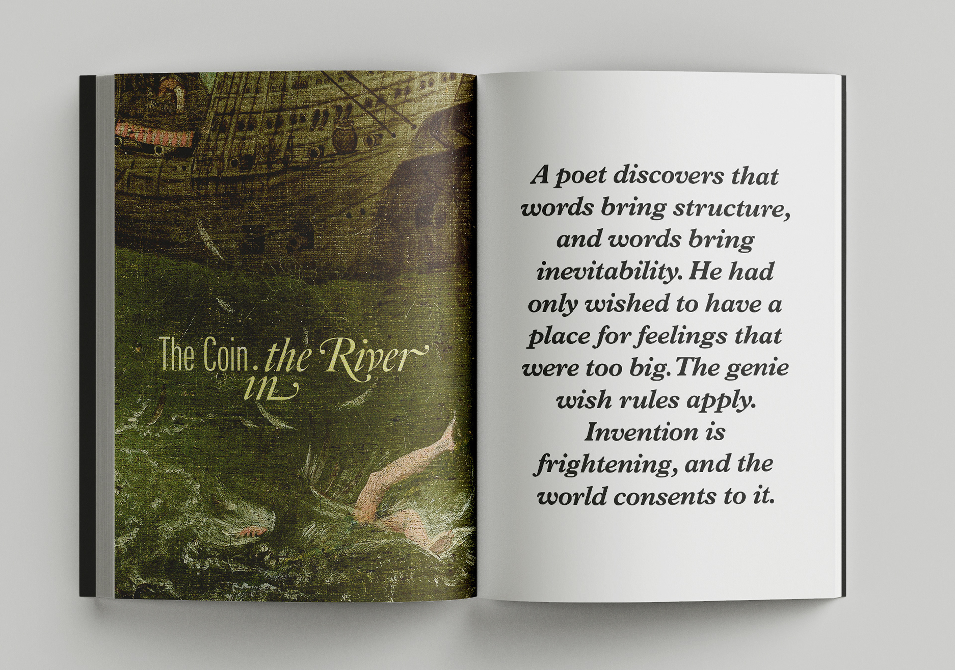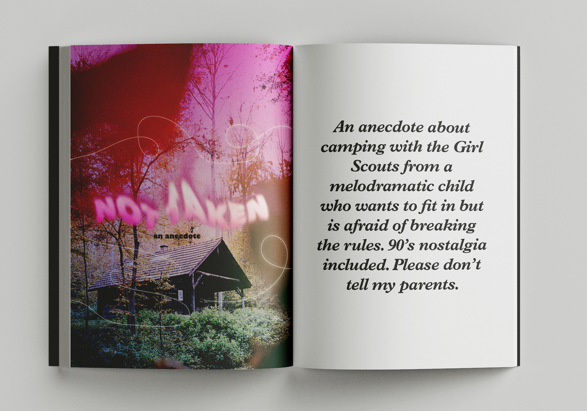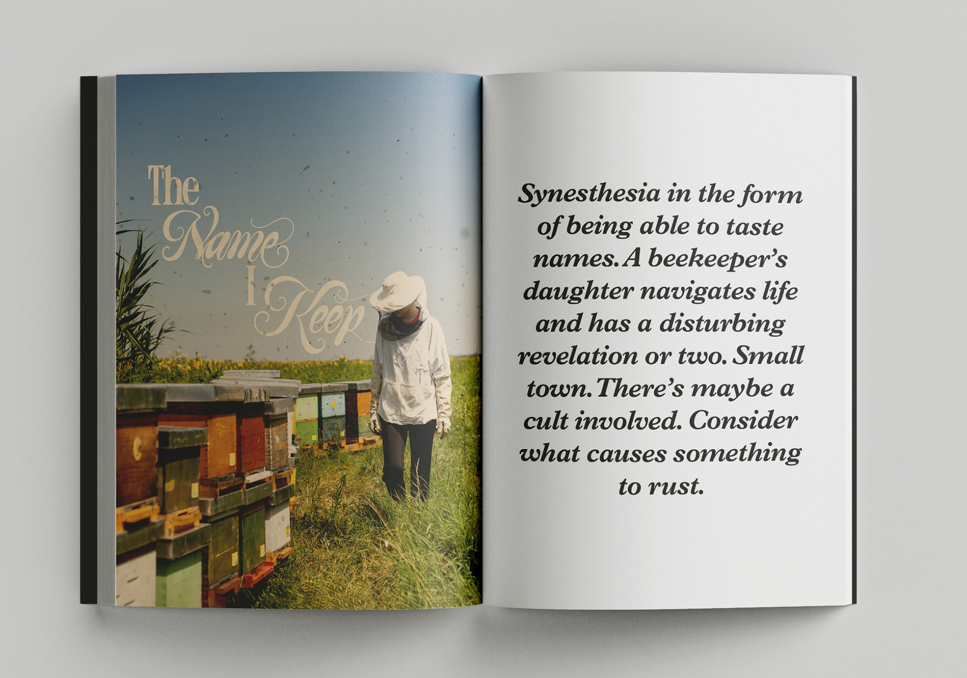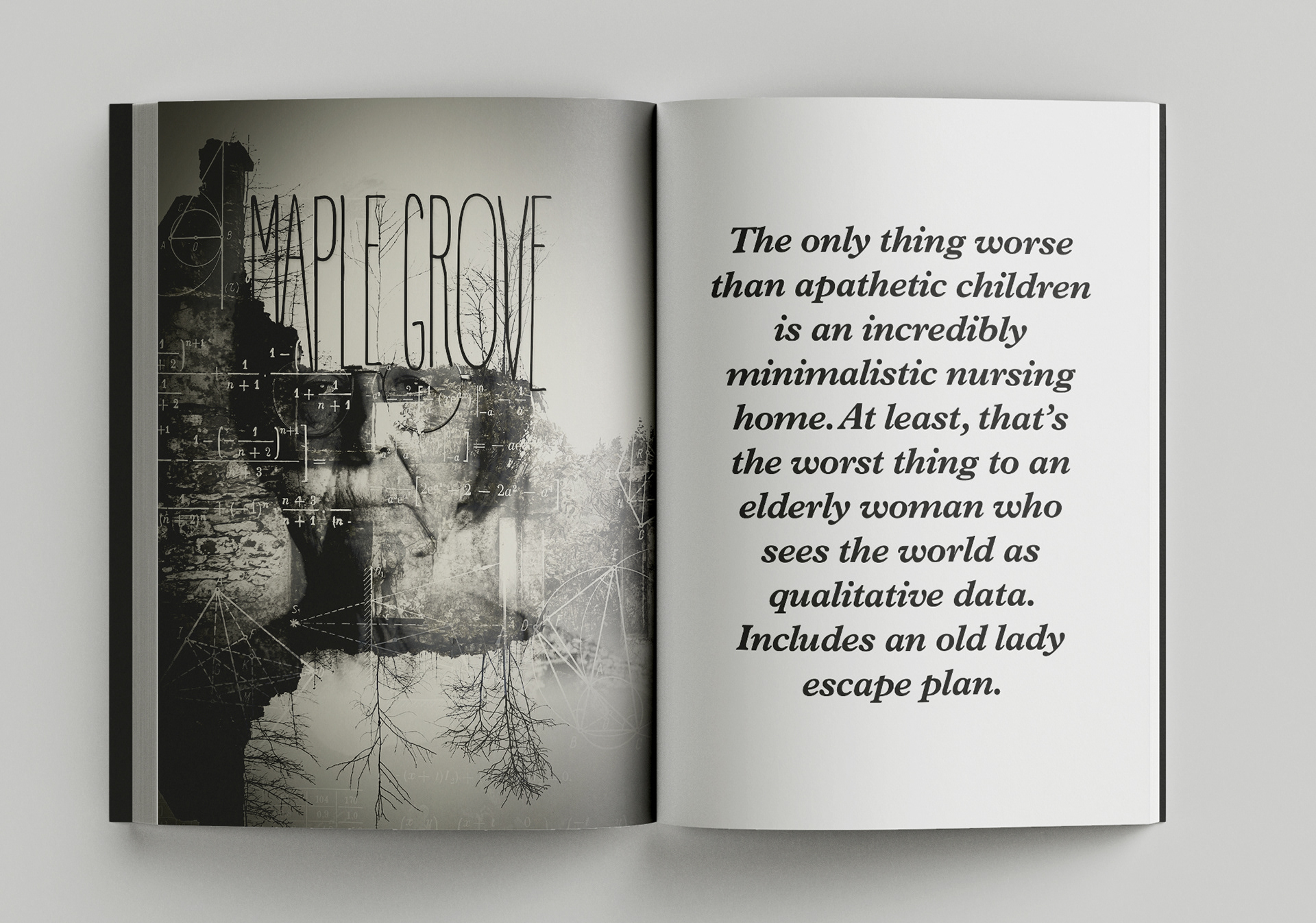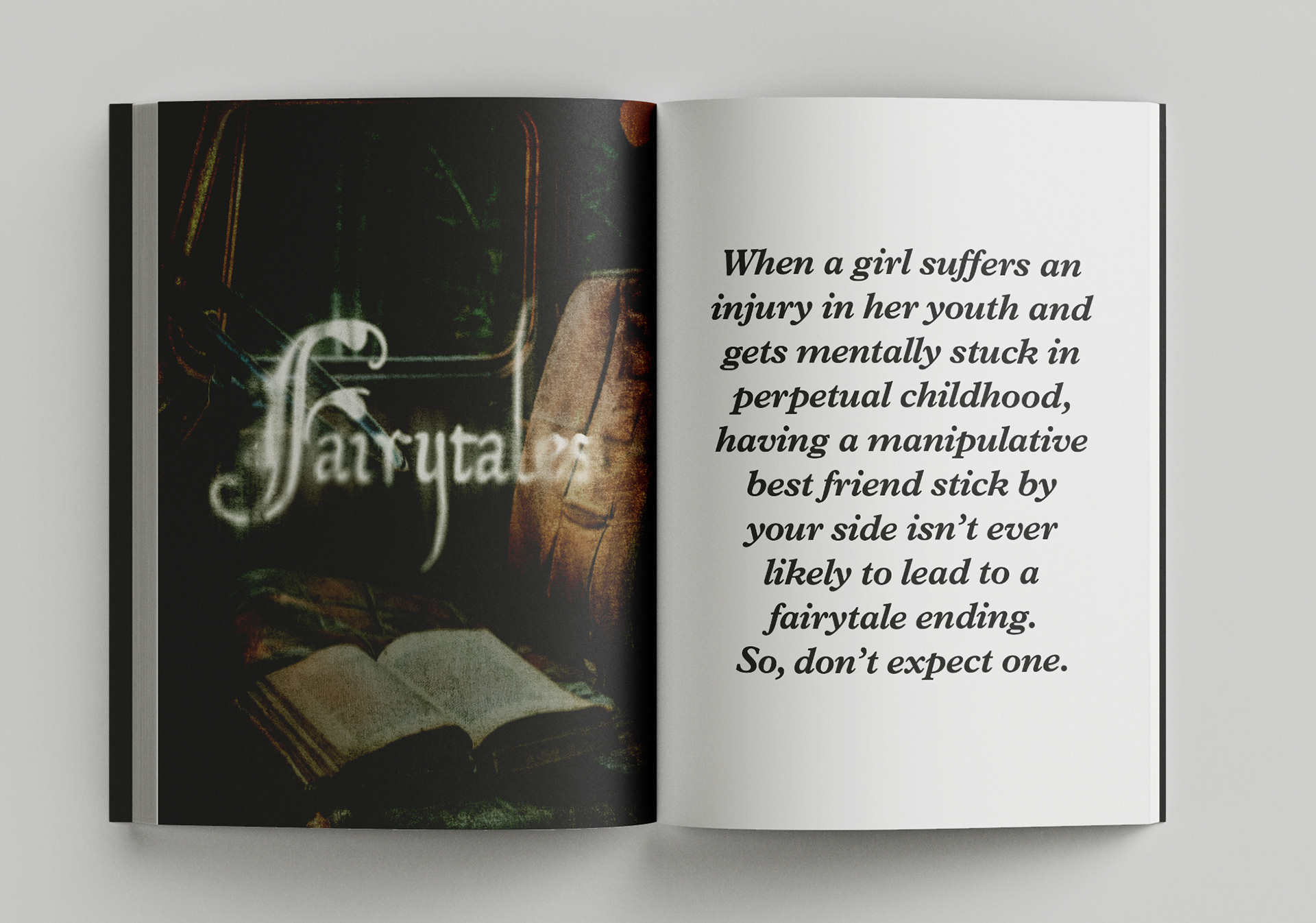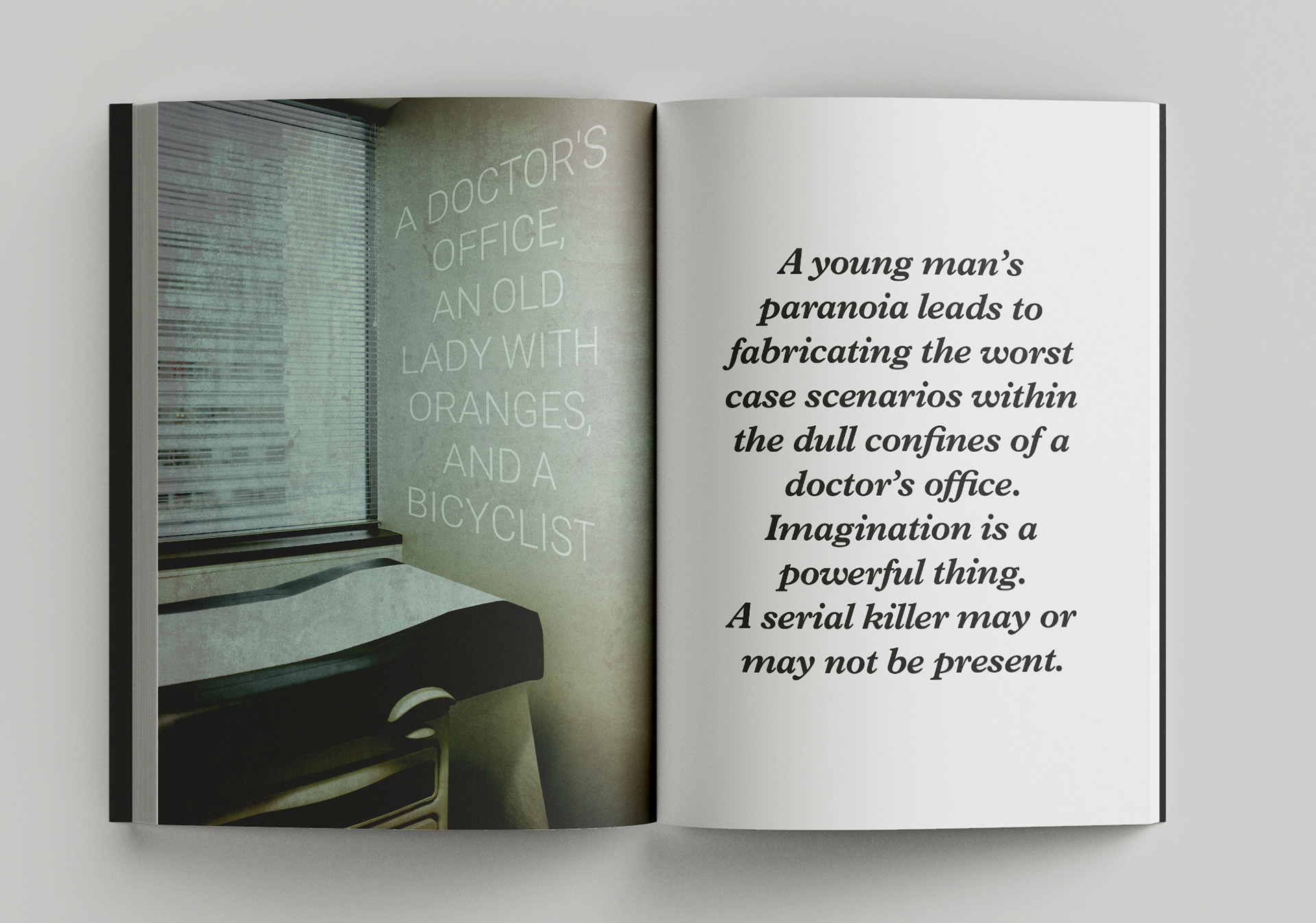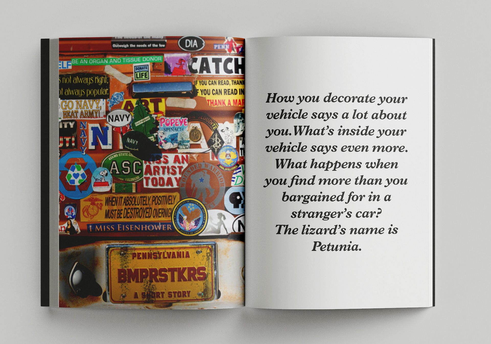
A modular cover system for Fragments. I built a shared type/spine template and a ‘distortion’ toolkit (grain, leaks, double exposure) so each story gets its own mood while the collection stays cohesive and thumbnail-legible.
Challenge:
Unify a set of very different short stories under one visual language... each cover should stand alone, read clearly at thumbnail size, and still feel like part of a single collection about “broken people.”
Unify a set of very different short stories under one visual language... each cover should stand alone, read clearly at thumbnail size, and still feel like part of a single collection about “broken people.”
Role:
Art direction, concept, photography/compositing, lettering, texture design, production templates.
Art direction, concept, photography/compositing, lettering, texture design, production templates.
Process:
System first: Defined a modular cover system: fixed title ladder and margins, shared spine/back templates, and a “one-accent-color” rule per story. Built two title lockups (quiet serif; expressive script) to match narrative tone.
System first: Defined a modular cover system: fixed title ladder and margins, shared spine/back templates, and a “one-accent-color” rule per story. Built two title lockups (quiet serif; expressive script) to match narrative tone.
Distortion library: Created repeatable Photoshop actions and smart-object overlays (grain, halation, light leaks, double exposure, chromatic aberration, ghosted type) to visualize fracture without sacrificing legibility.
Solution:
A cohesive cover system anchored by consistent type structure and a controlled palette, with narrative-specific distortion to signal theme and mood. Each cover feels custom; the set reads unmistakably as one collection.
A cohesive cover system anchored by consistent type structure and a controlled palette, with narrative-specific distortion to signal theme and mood. Each cover feels custom; the set reads unmistakably as one collection.
Outcome:
Reliable readability across storefront thumbnails and print proofs, faster new-cover turnaround (typically < 1 hour using the template), and a cohesive visual identity that doubled as social promo graphics for the series.
Reliable readability across storefront thumbnails and print proofs, faster new-cover turnaround (typically < 1 hour using the template), and a cohesive visual identity that doubled as social promo graphics for the series.