
Detail close-ups
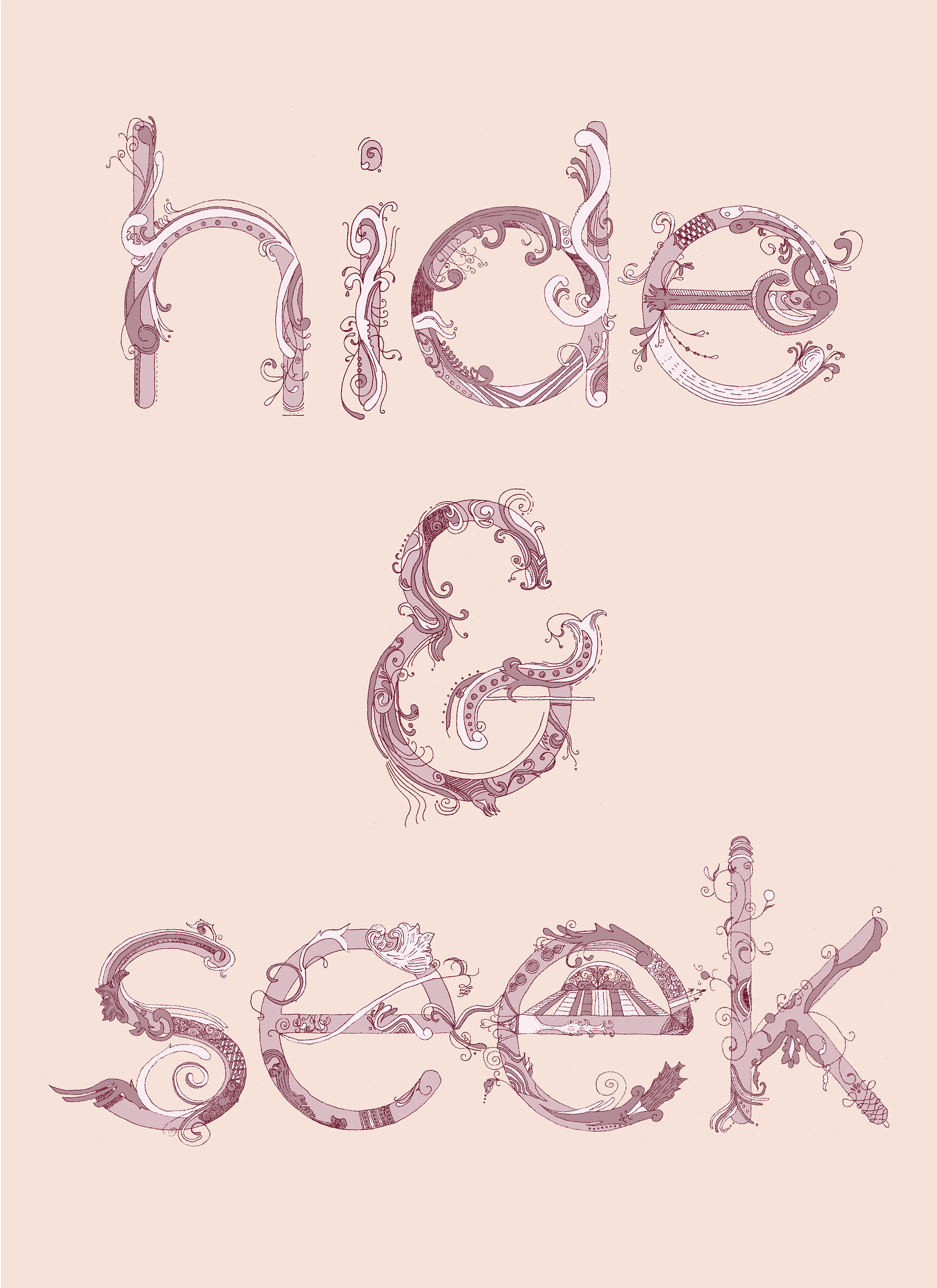
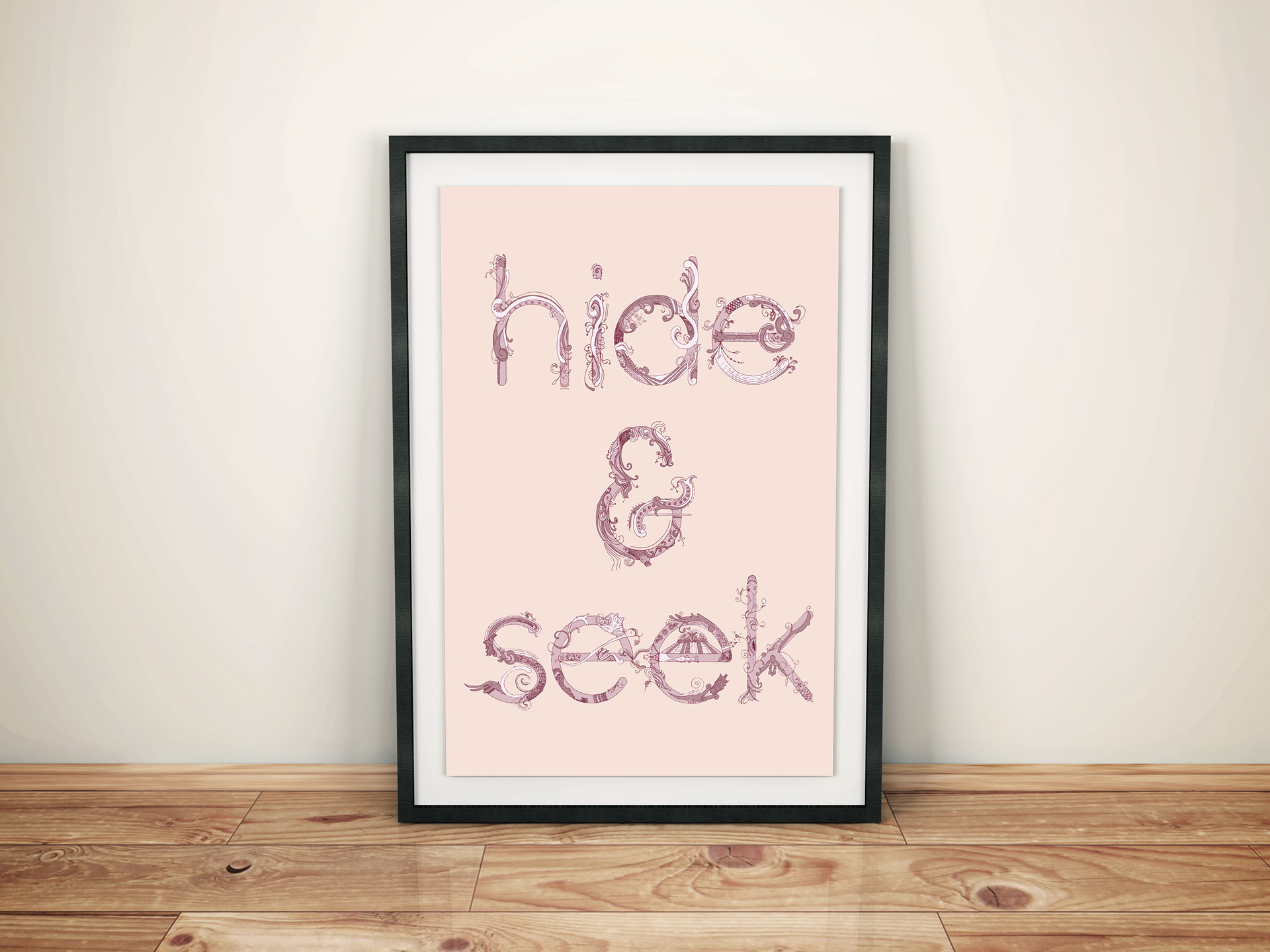
For my Typography II final, we had to design and execute our own project. This is hand-drawn type, but based around the typeface called "Quicksand." After studying the typeface, I loved the simplicity of it and wanted to frivolously embellish it. I took inspiration from historical flourishes. This was featured in York College's Typorama show in summer 2012 and the Paul Sahre Juried show in 2013.