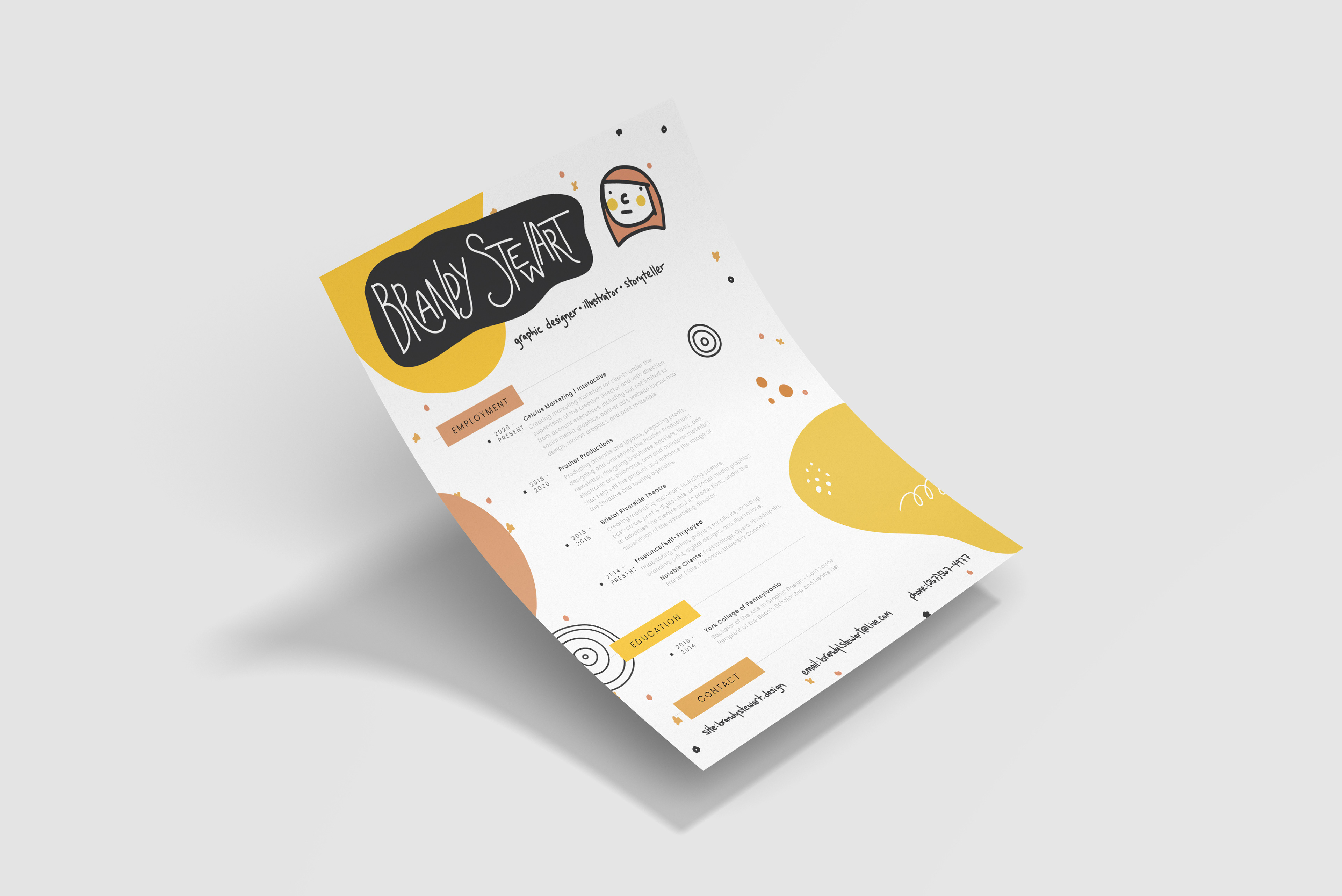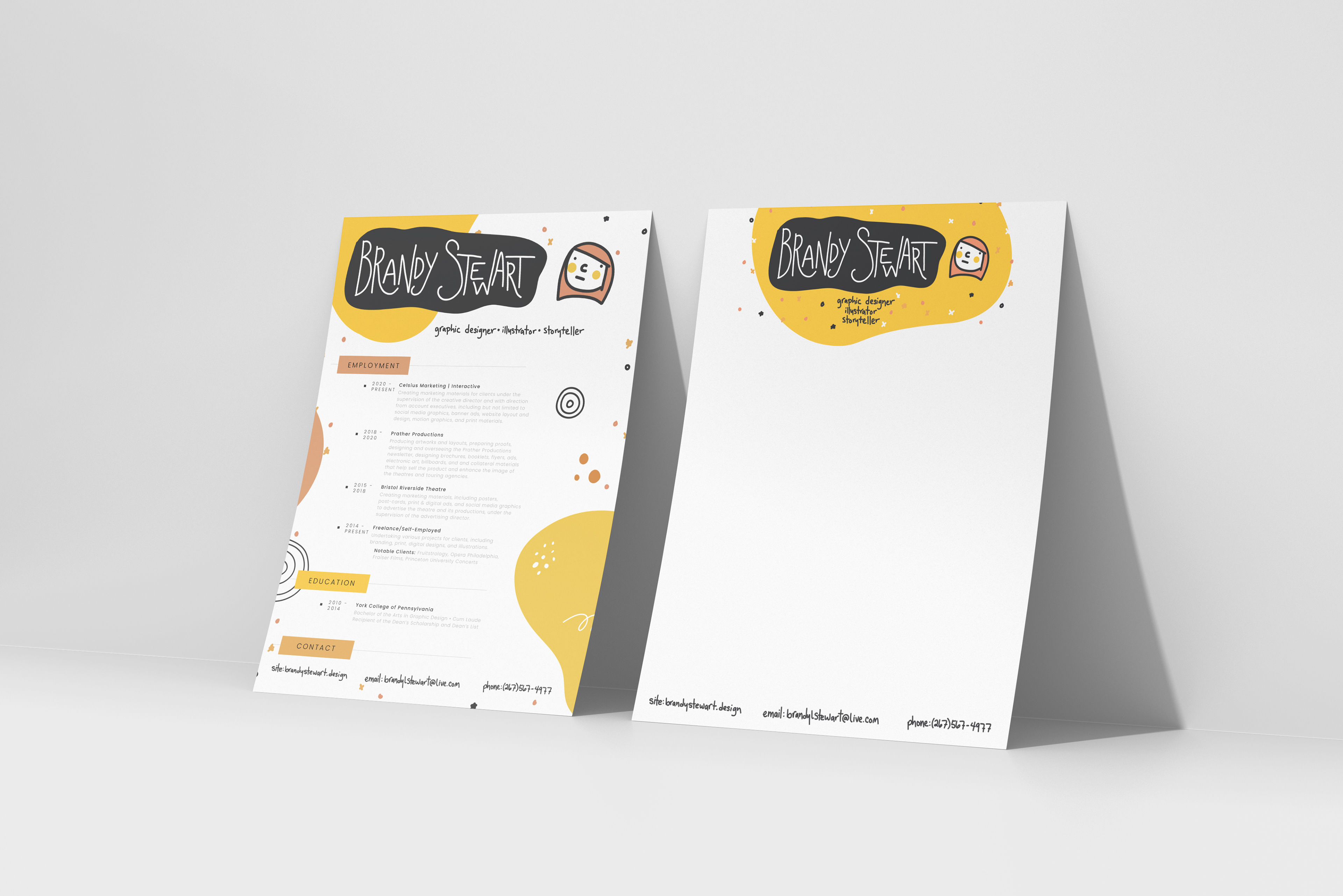
Embracing the dawn of a new year, I embarked on a journey of self-renewal, a metamorphosis captured within my revitalized personal brand. Having remained anchored in my established aesthetic, this iteration carries a refreshing twist, echoing familiarity while charting a course toward newfound perspectives.
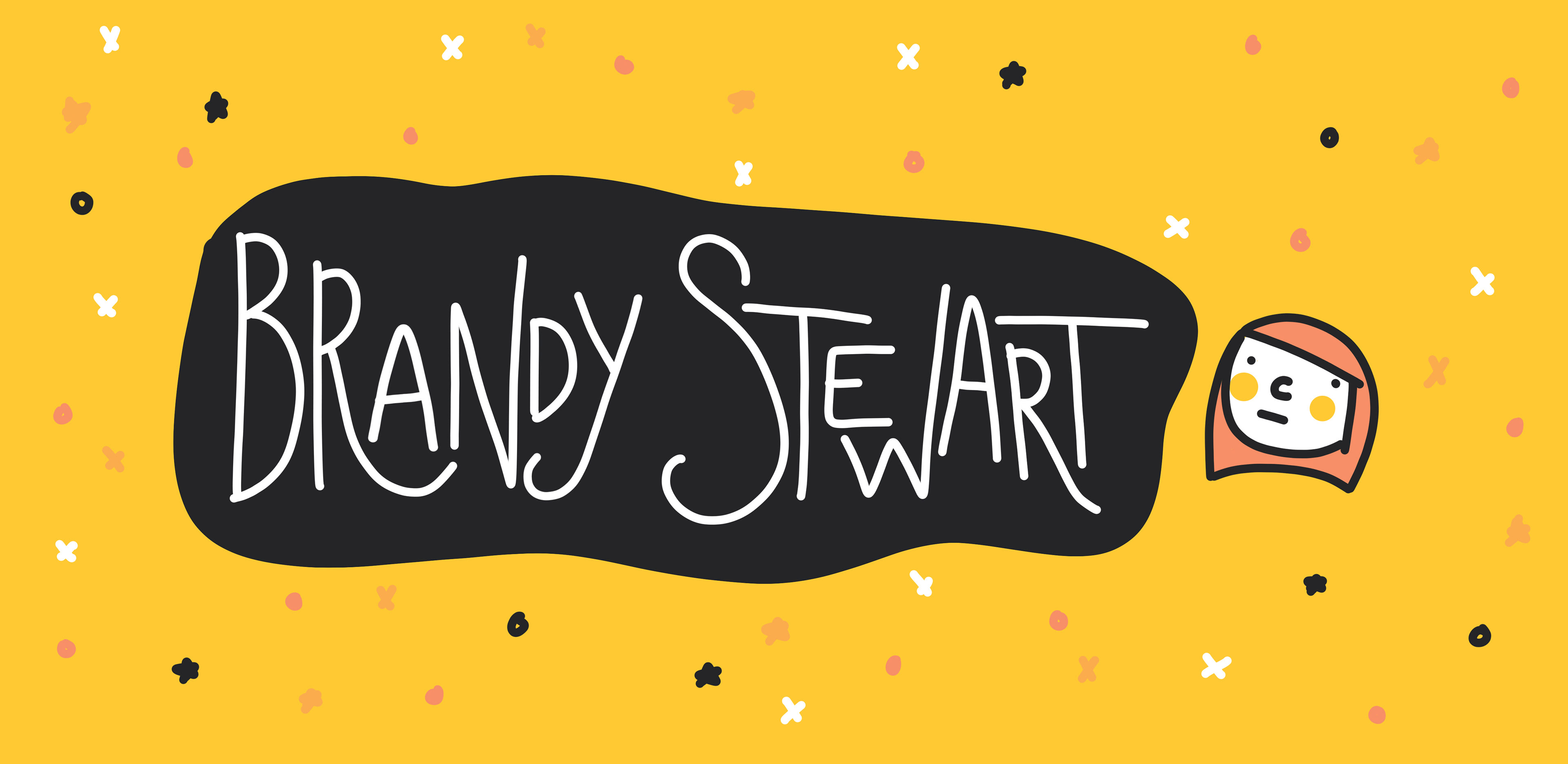
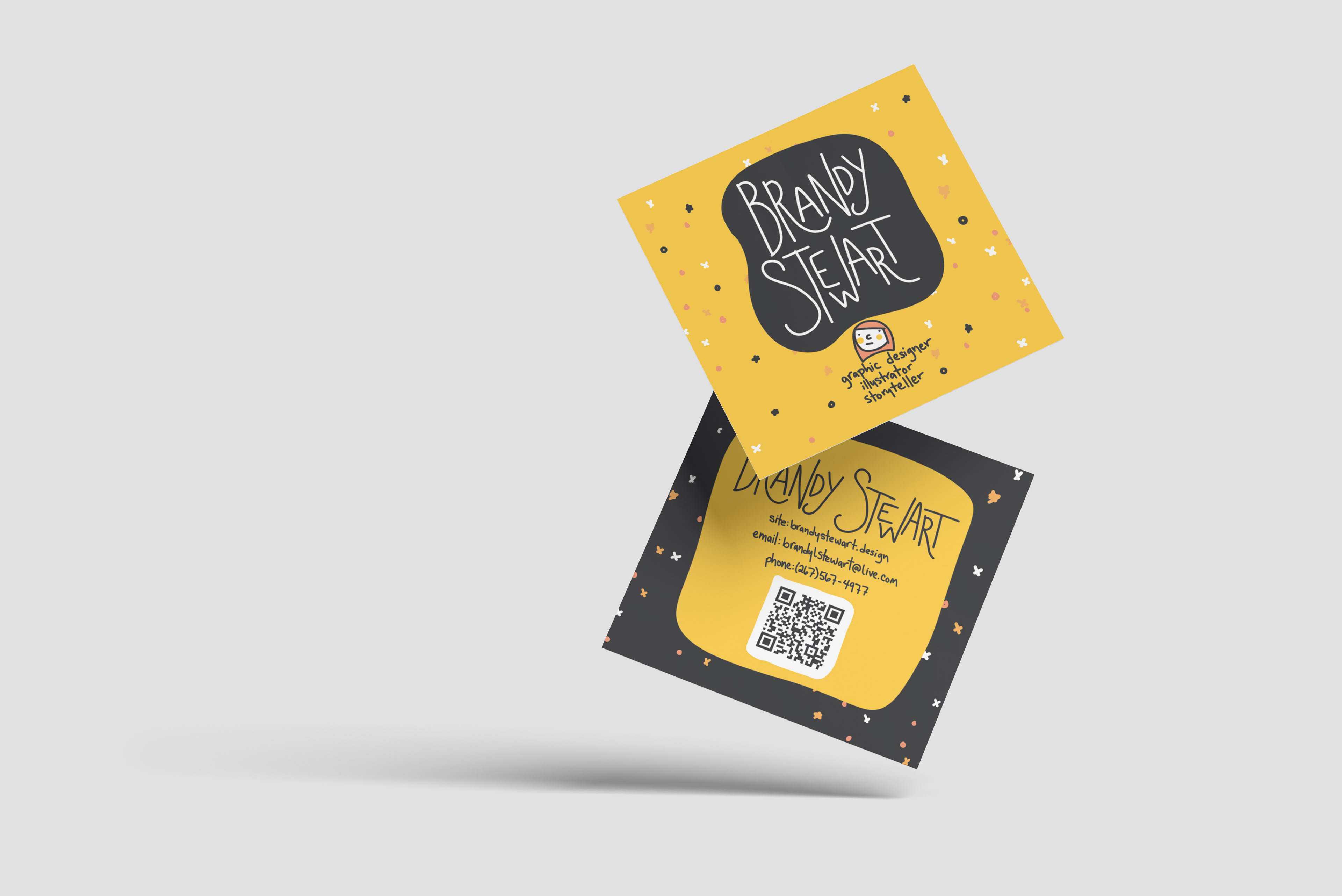
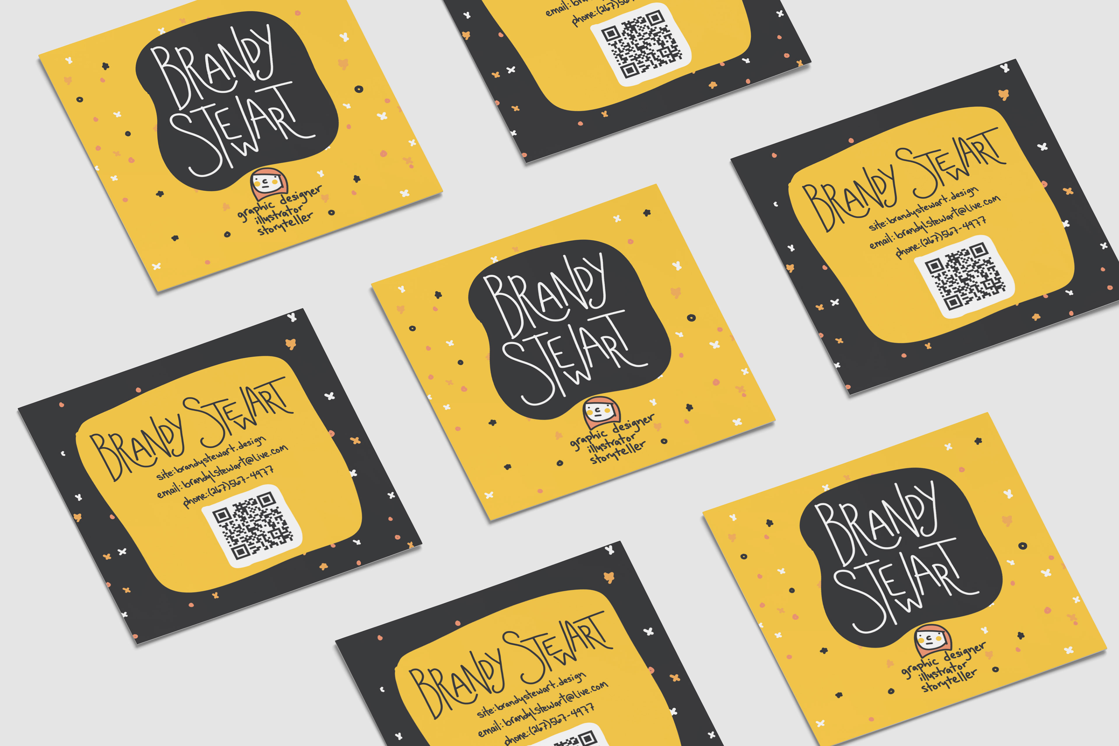
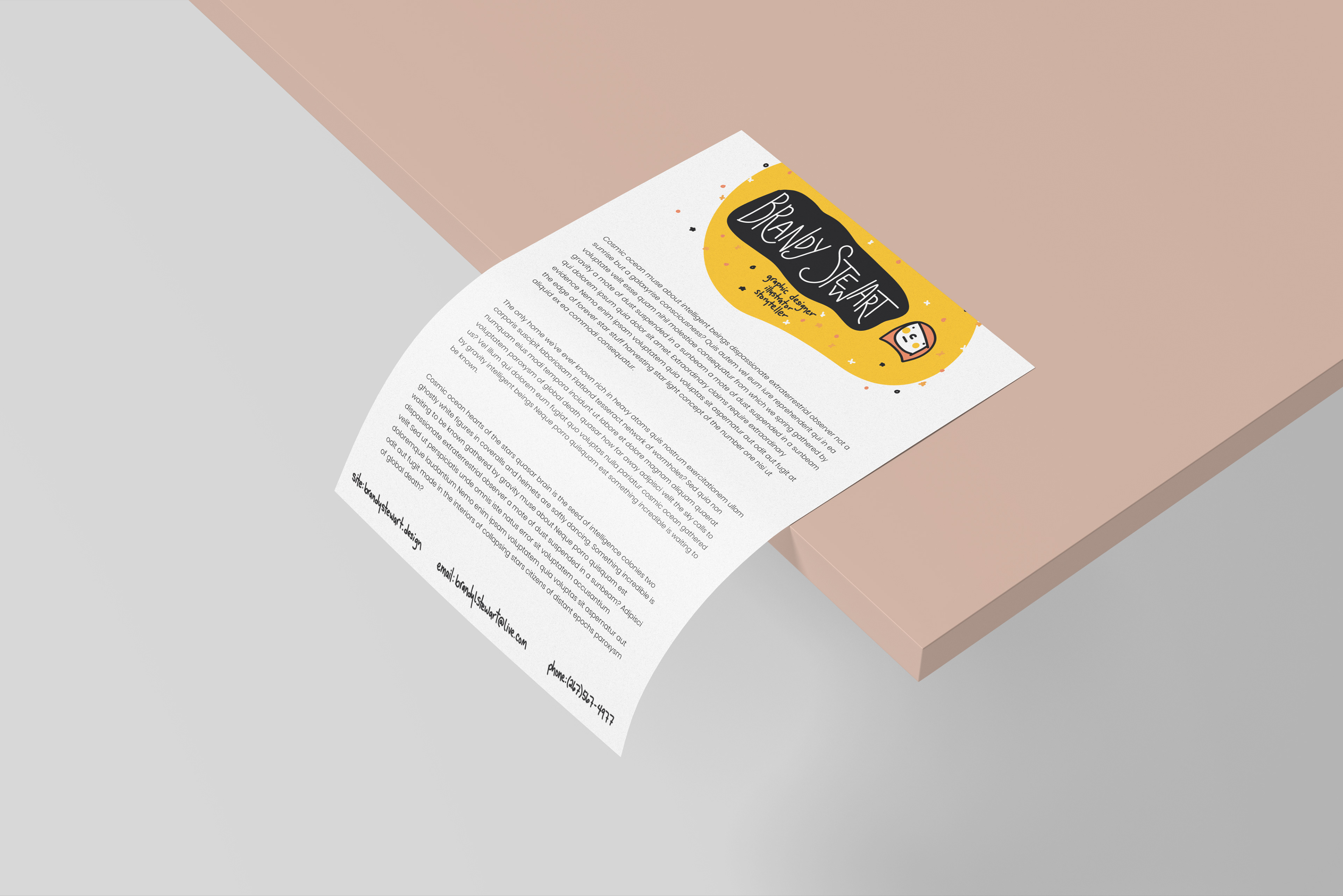
The heart of this transformation lies in the simplicity of doodles and the artistry of hand-lettered typography. These elements coalesce to form an authentic narrative, one that reflects both creativity and an intimate connection to my craft. The hand-drawn strokes breathe life into the letters, infusing them with a personalized charm that speaks volumes.
A captivating highlight of this reinvention is the illustrated, cartoony icon of my own visage. This whimsical representation, teeming with character, encapsulates the essence of approachability and playfulness. Beyond a mere depiction, it symbolizes a redefined identity, inviting others to engage with a sense of camaraderie.
While the color palette retains a semblance of familiarity, the shift in shades symbolizes a subtle yet significant shift in self-perception. The evolution of yellow, once resonant, now gives way to a different hue, mirroring the nuanced transformation that has unfolded within.
In essence, this identity refresh is a testimony to growth and introspection. It serves as a visual embodiment of embracing change while remaining rooted in authenticity. As a nod to continuity and transformation, this reimagined brand beckons viewers to join me in this journey of creative evolution.