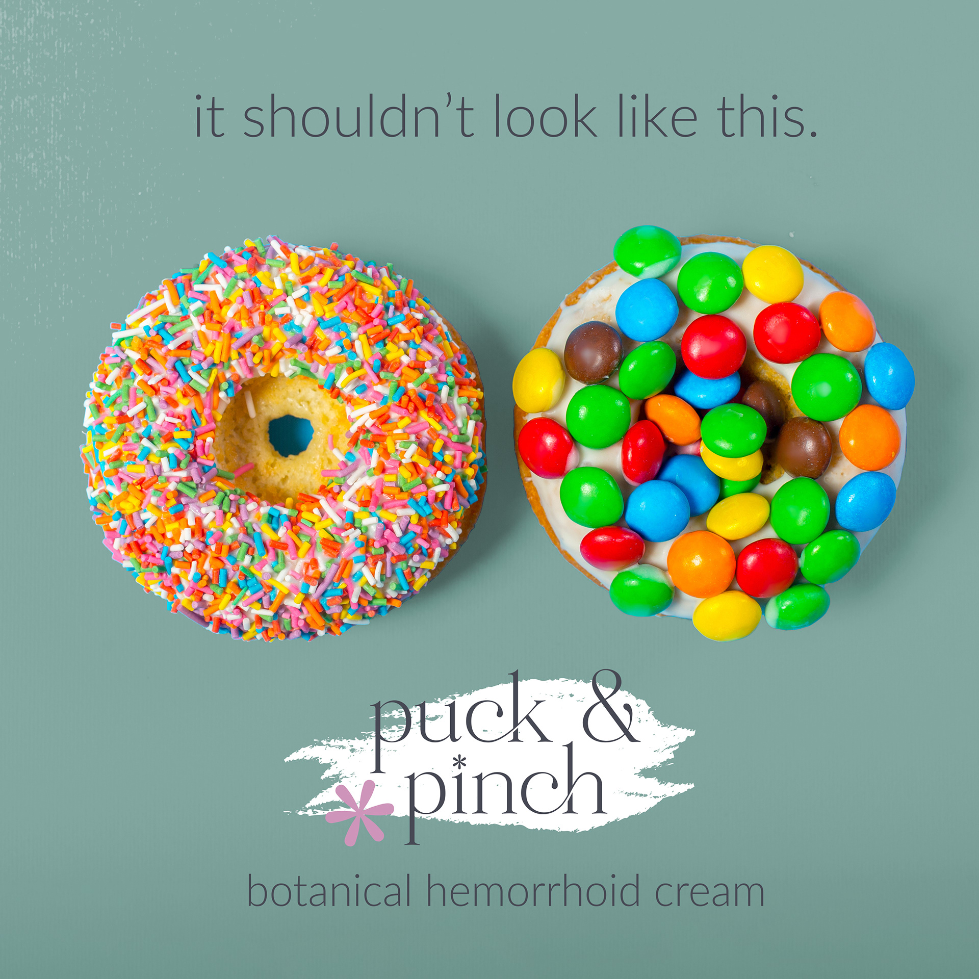
Puck and Pinch is a botanical hemorrhoid cream company that embraces a unique blend of class and humor in its branding. The challenge was to create a logo and packaging design that balances a soft, clean aesthetic with a brand voice that isn’t afraid to be a bit cheeky (very cheeky).
The logo is designed to be sophisticated yet playful. The focal point is an asterisk, subtly styled to resemble a butthole, adding a touch of humor without compromising on elegance. This element is consistently used across various design elements to reinforce brand identity.
The overall visual style is soft and clean, utilizing gentle colors and minimalist design principles to create a soothing and approachable look. This design choice contrasts intentionally with the brand's voice, which playfully acknowledges the product's purpose with mentions of butts and holes.
The brand voice is a key component of Puck and Pinch, leaning into the nature of the product with a sense of humor. By openly addressing the product's purpose in a light-hearted manner, the brand breaks down taboos and connects with customers on a more personal level.
Puck and Pinch’s branding and packaging design successfully marry class with humor, creating a distinctive and approachable identity for a product that addresses a sensitive issue. This project showcases the ability to balance contrasting elements to create a cohesive and engaging brand experience.


