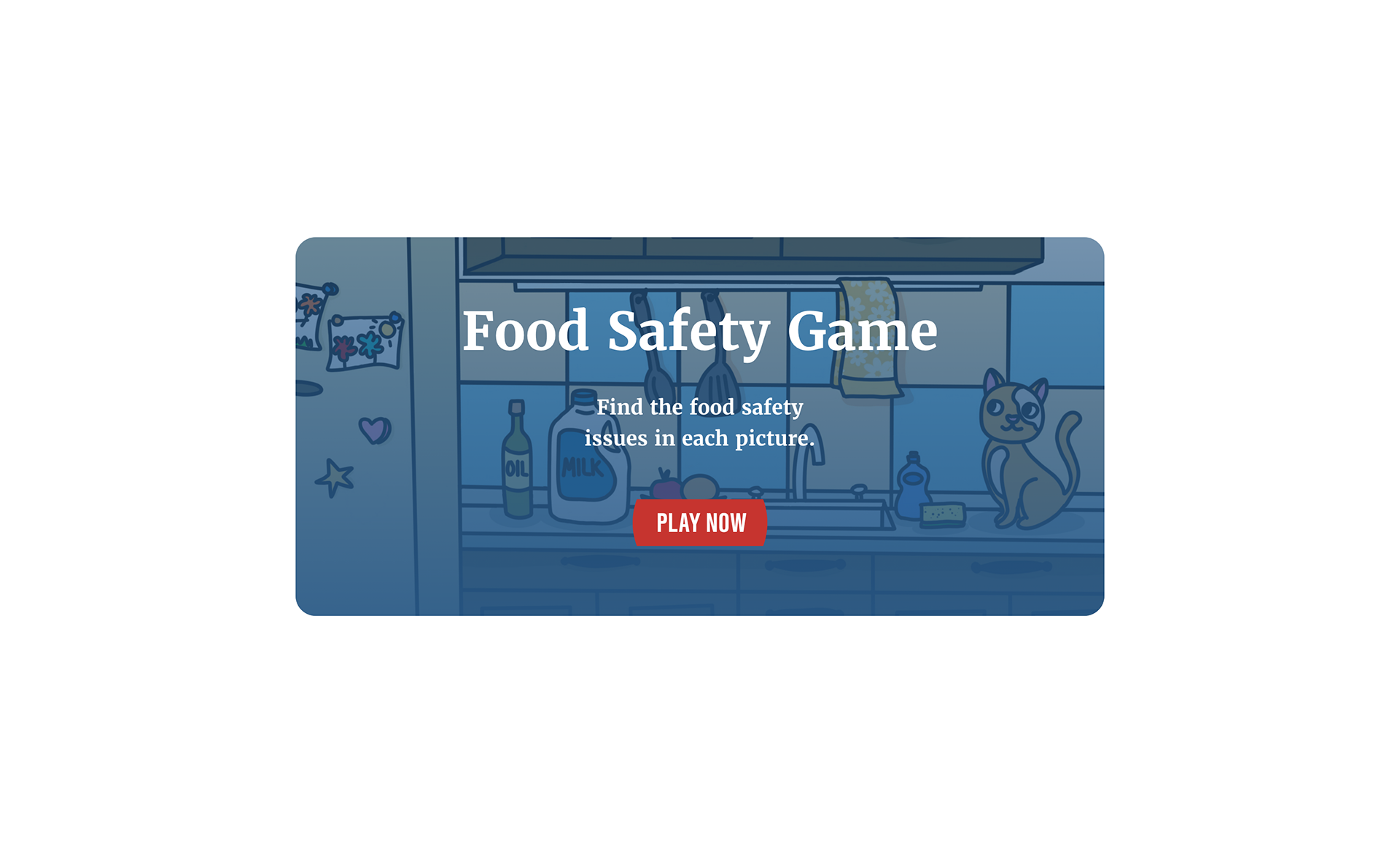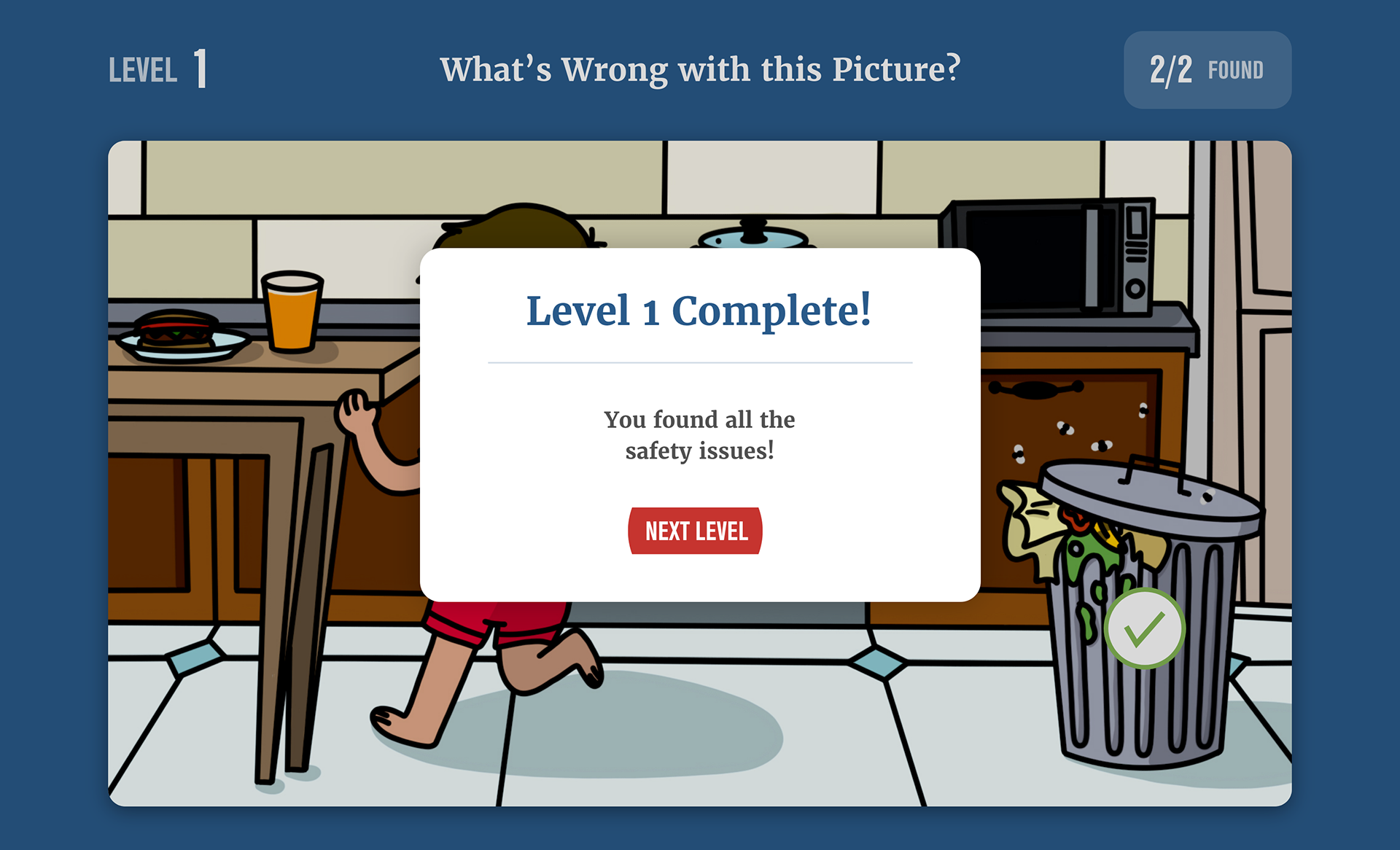
Interactive ‘spot-the-error’ kitchen scenes for ISU’s Spend Smart, Eat Smart. I illustrated four vector kitchens, wrote the tooltip tips, and packaged SVG/hotspot assets so the web team could drop in accessible, click-to-learn food-safety lessons.
Challenge:
Help Iowa State University Extension & Outreach’s Spend Smart, Eat Smart program teach kitchen safety in a way that’s fast, friendly, and memorable for a broad audience—on desktop and mobile.
Help Iowa State University Extension & Outreach’s Spend Smart, Eat Smart program teach kitchen safety in a way that’s fast, friendly, and memorable for a broad audience—on desktop and mobile.
Role:
Concepts, illustration, UX writing (tooltips), accessibility, web handoff and mockups.
Concepts, illustration, UX writing (tooltips), accessibility, web handoff and mockups.
Process:
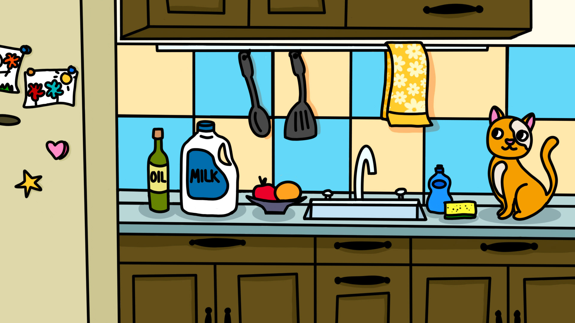
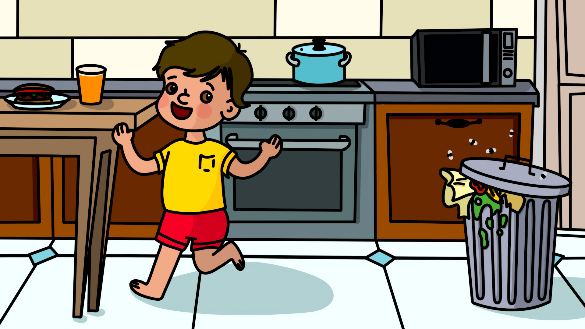
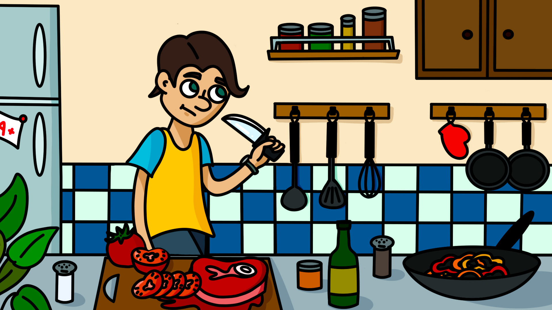
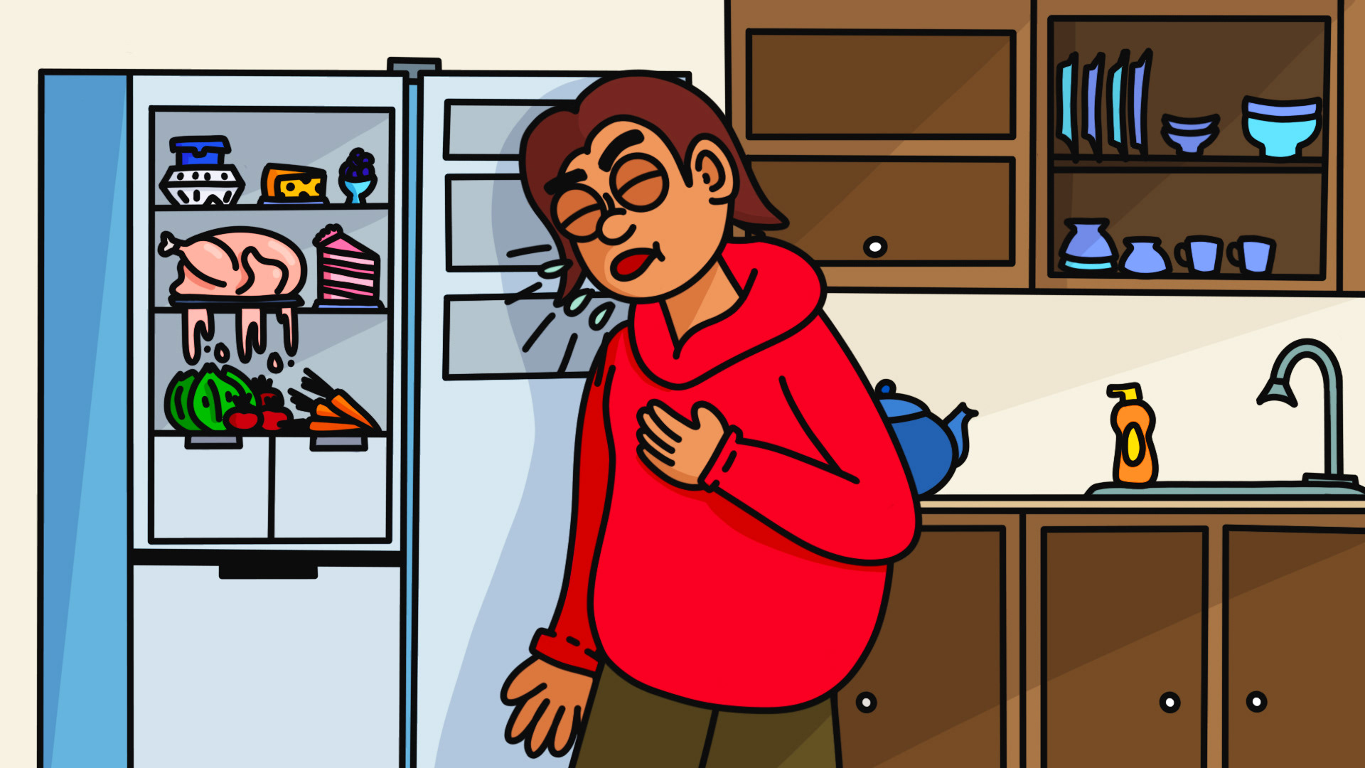
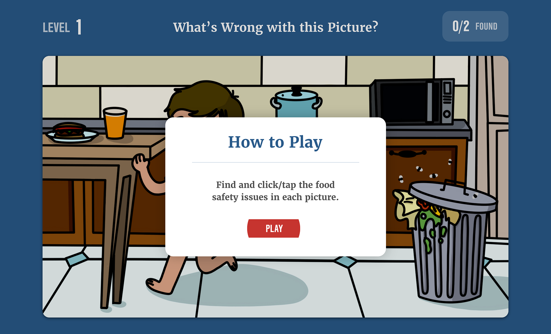
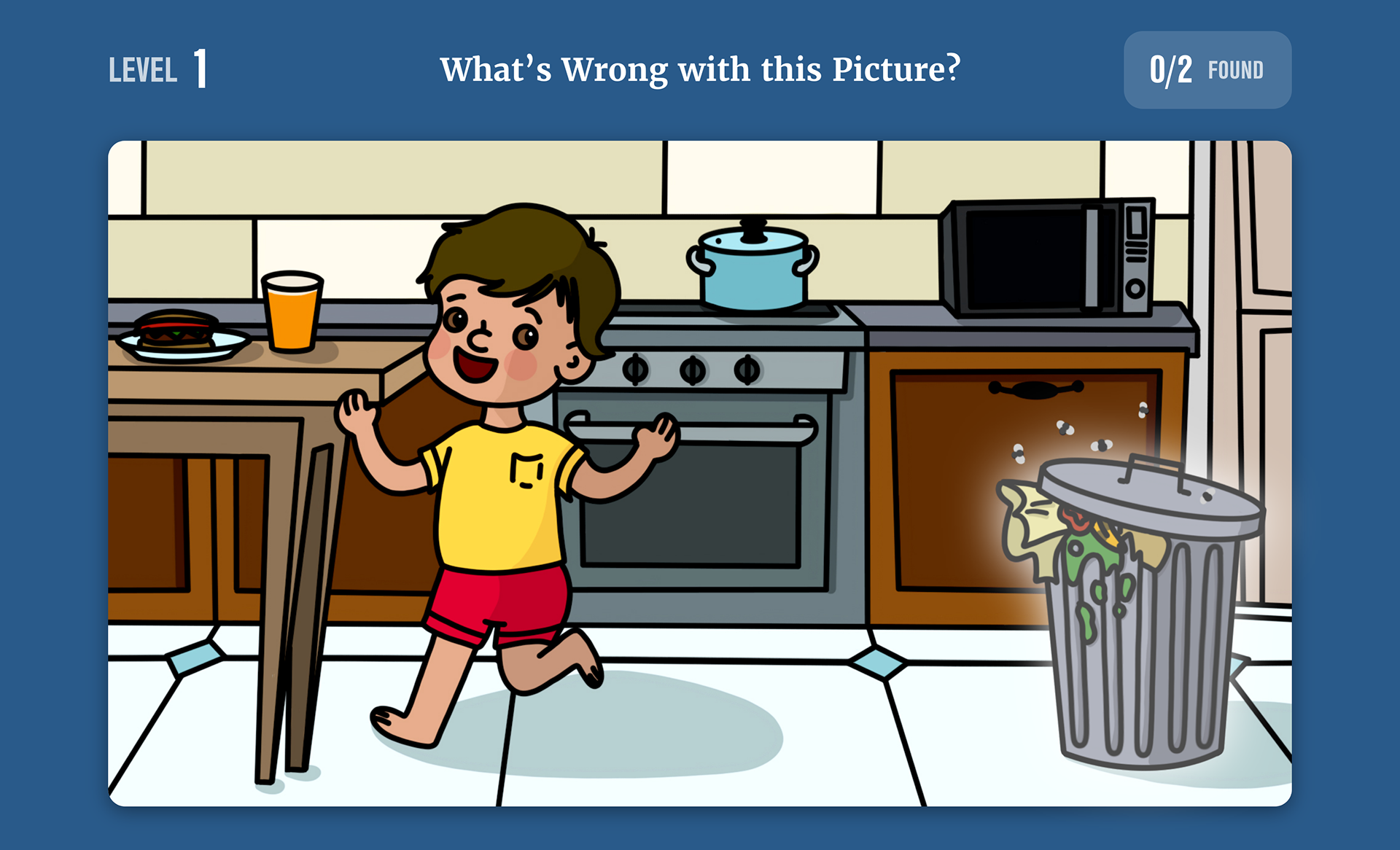
Content mapping: Partnered with program staff to define four kitchen scenarios and two “find-the-error” moments per scene (e.g., cross-contamination, knife safety, spoiled food, pest exposure).
Content mapping: Partnered with program staff to define four kitchen scenarios and two “find-the-error” moments per scene (e.g., cross-contamination, knife safety, spoiled food, pest exposure).
Style system: Built a bold, coloring-book visual language (clean outlines, flat fills, high contrast) that stays legible at small sizes and reads instantly for kids and adults.
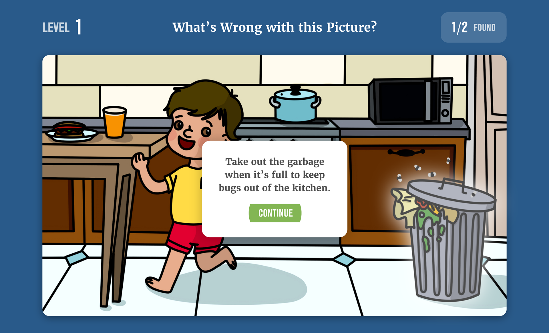
Interaction model: Designed hotspot placements and states (default → hover/focus → correct), with concise pop-up explanations and links to deeper resources.
Accessibility: Ensured keyboard access to hotspots, 4.5:1 contrast floor, descriptive alt text, and motion-free feedback for low-sensory users.
Web handoff: Delivered layered SVGs with named groups for hotspots, JSON coordinate maps, tooltip copy, and responsive comps to show how the scenes scale on the site.
Solution:
Four engaging kitchen illustrations where visitors “spot the two issues,” click/tap hotspots, and get plain-language safety tips. The playful style lowers the barrier to entry; clear microcopy reinforces best practices.
Four engaging kitchen illustrations where visitors “spot the two issues,” click/tap hotspots, and get plain-language safety tips. The playful style lowers the barrier to entry; clear microcopy reinforces best practices.
Outcome:
In usability tests, scenes increased time-on-page and completion of the two-error challenge; educators reused the art in workshops and printable handouts thanks to the vector asset pack.
In usability tests, scenes increased time-on-page and completion of the two-error challenge; educators reused the art in workshops and printable handouts thanks to the vector asset pack.
Deliverables:
4 interactive scenes (SVG), hotspot maps + tooltip copy, responsive page mockups, print-ready one-pagers, and an implementation guide.
4 interactive scenes (SVG), hotspot maps + tooltip copy, responsive page mockups, print-ready one-pagers, and an implementation guide.