See live at: www.tysoneye.com
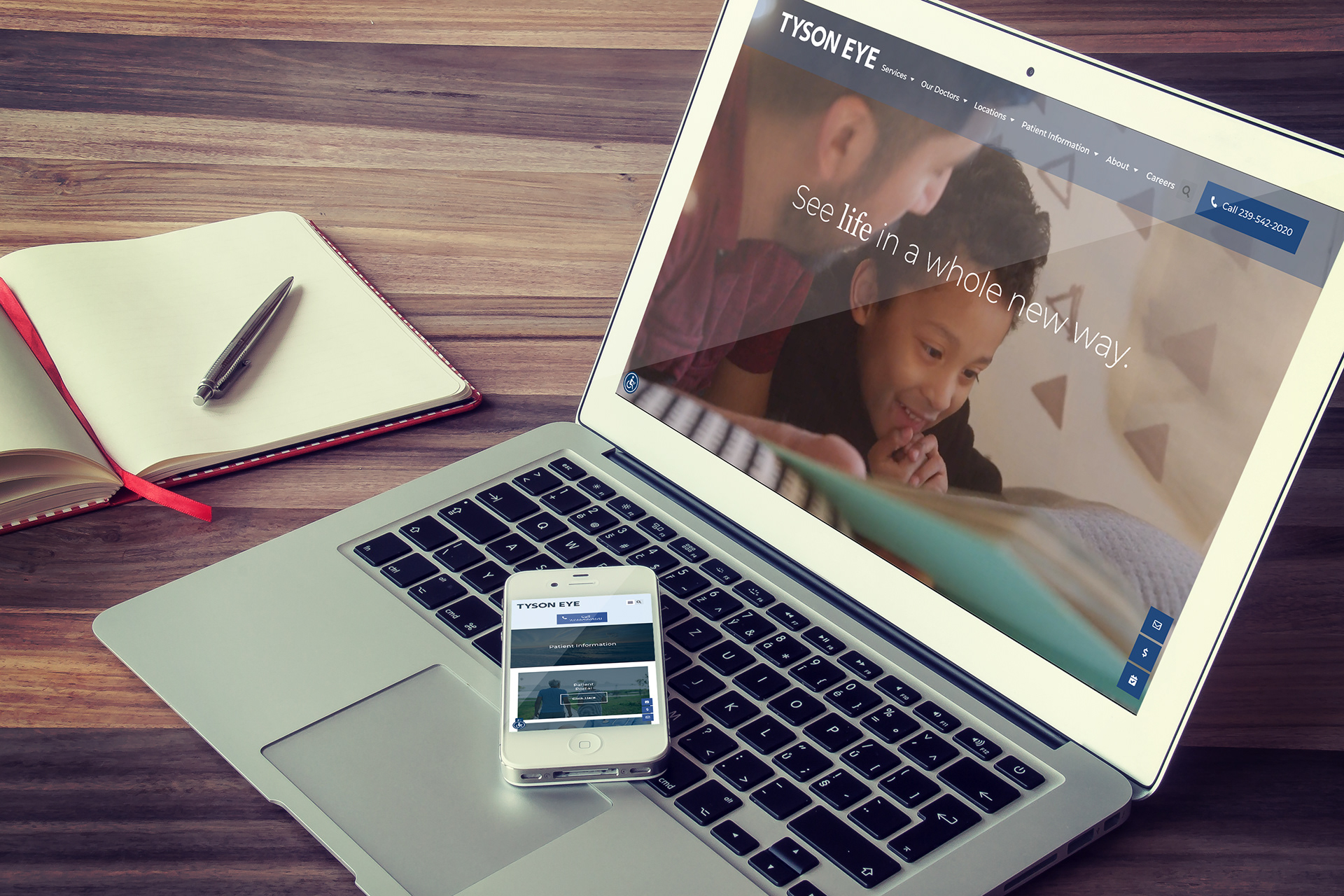
Premier practice, outdated site, mixed UX. I led the redesign to modernize the brand feel and make the experience effortless for an older patient audience: clean layouts, plain-language copy, and accessibility-first readability so key actions (services, locations, booking/contact) are easy to find.
Challenge:
Refresh a leading Southwest Florida eye care brand with a site that feels current and credible, while prioritizing clear navigation, high readability, and accessible content for older users.
Refresh a leading Southwest Florida eye care brand with a site that feels current and credible, while prioritizing clear navigation, high readability, and accessible content for older users.
Role:
Design lead; UX/UI direction, page layout + hierarchy, copy editing for clarity, accessibility-minded design decisions, and collaboration with development on implementation (including the accessibility widget).
Design lead; UX/UI direction, page layout + hierarchy, copy editing for clarity, accessibility-minded design decisions, and collaboration with development on implementation (including the accessibility widget).
Process:
Audience & Goals: Defined primary users (older patients + caregivers) and high-intent tasks (find a doctor/service, understand procedures, contact/appointments).
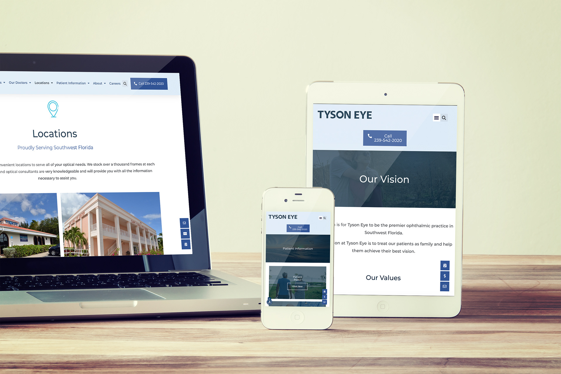
Information Design: Simplified navigation and page flow; prioritized top services and “next step” CTAs in predictable placements.
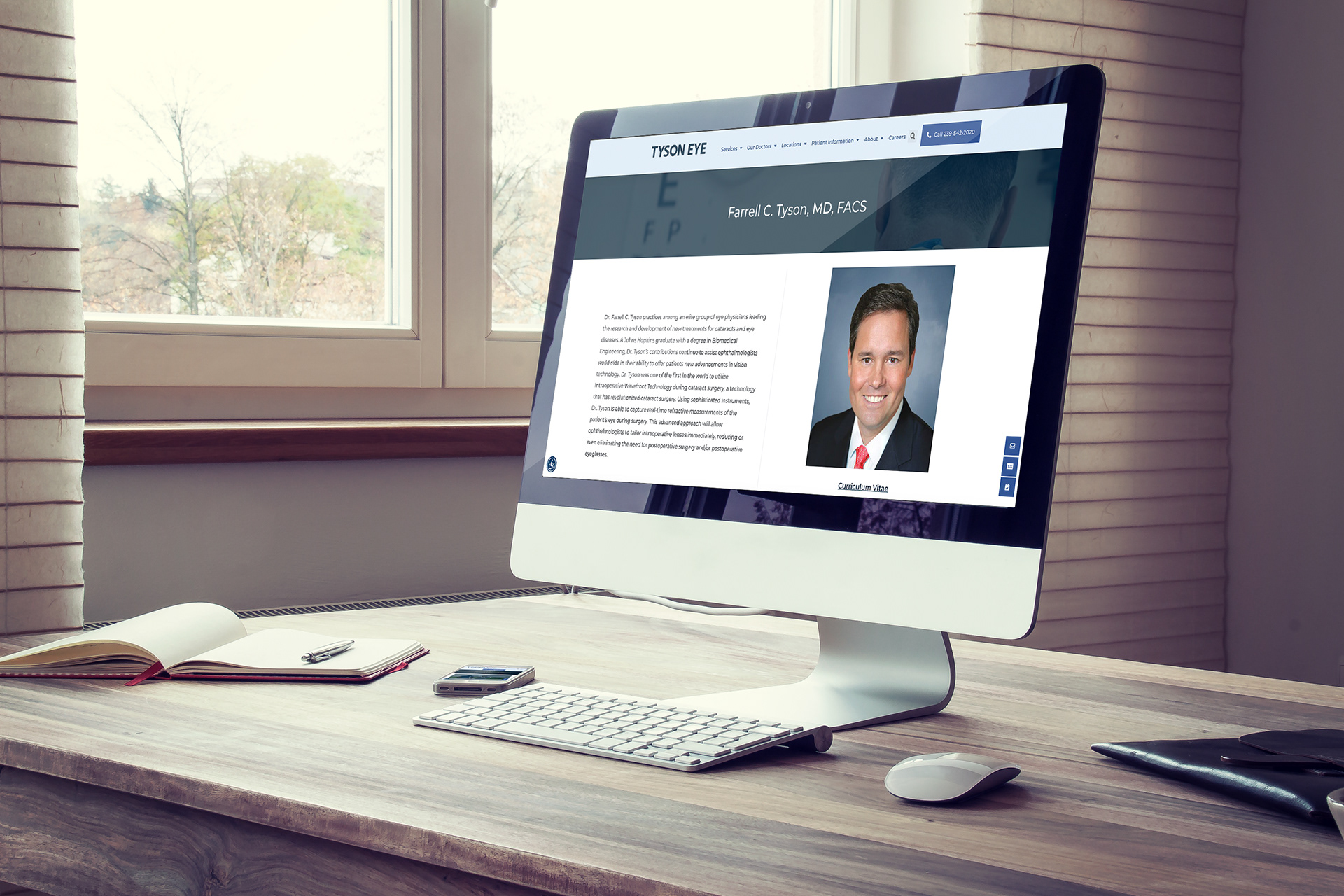
UI Refresh: Modern, clinical visual system. Generous whitespace, calm typography, and photo usage that reinforces professionalism without clutter.
Readability & Accessibility: Larger type scale, strong contrast, clear link states, and scannable headings; ensured copy avoids jargon and reads cleanly.
Copy Pass: Tightened and clarified messaging across pages. Shorter sentences, clearer labels, and more direct CTA language.
Dev Partnership: Coordinated specs and content updates with the dev team; aligned on accessibility widget usage and overall on-page accessibility basics.
Solution:
A modern, easy-to-navigate site that matches Tyson Eye’s reputation: calm, clean design with straightforward language and patient-friendly structure.
A modern, easy-to-navigate site that matches Tyson Eye’s reputation: calm, clean design with straightforward language and patient-friendly structure.
Deliverables:
Website UX/UI design direction, page layouts/templates, updated on-site copy (clarified + edited), and developer handoff guidance.
Website UX/UI design direction, page layouts/templates, updated on-site copy (clarified + edited), and developer handoff guidance.